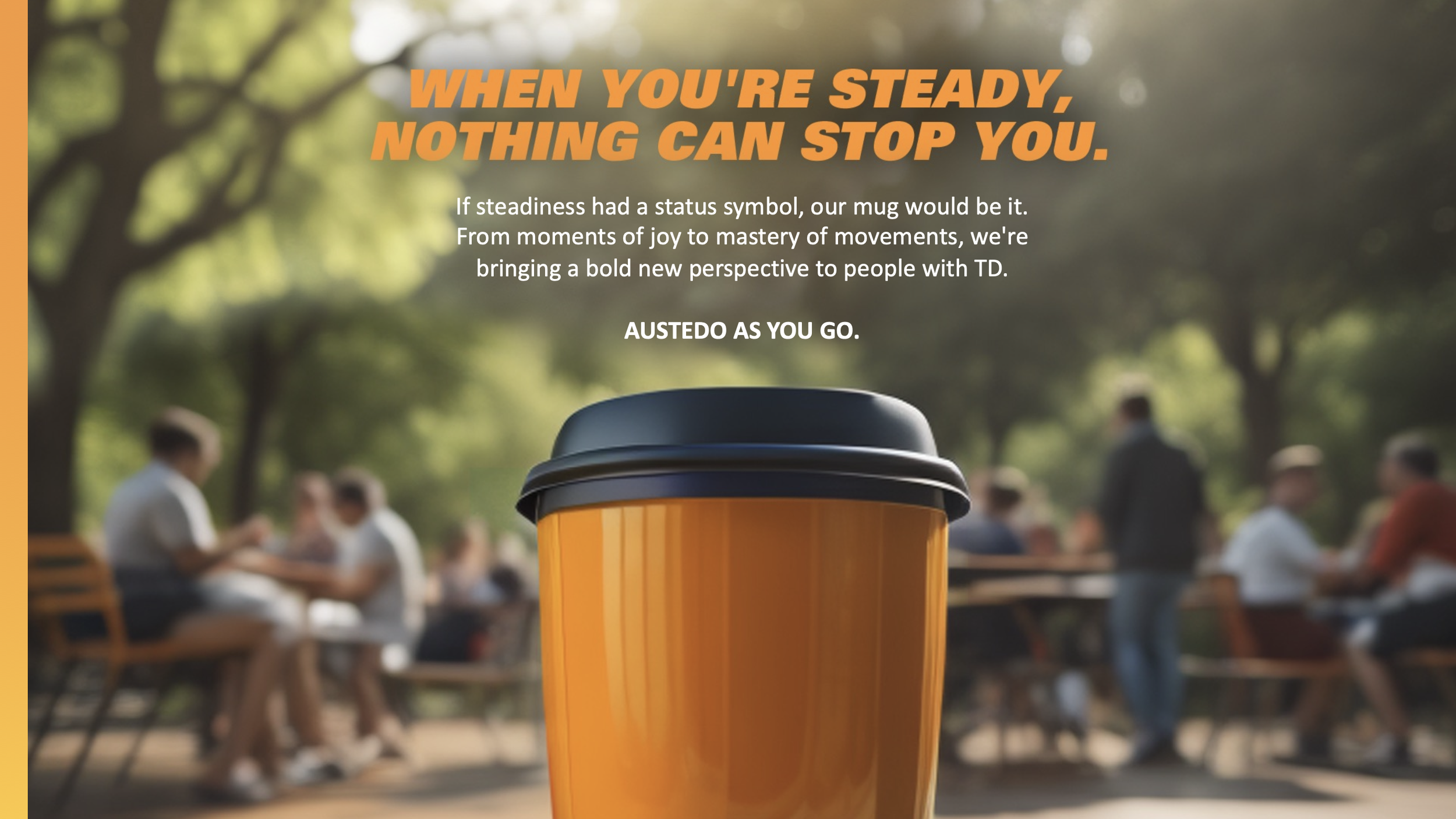
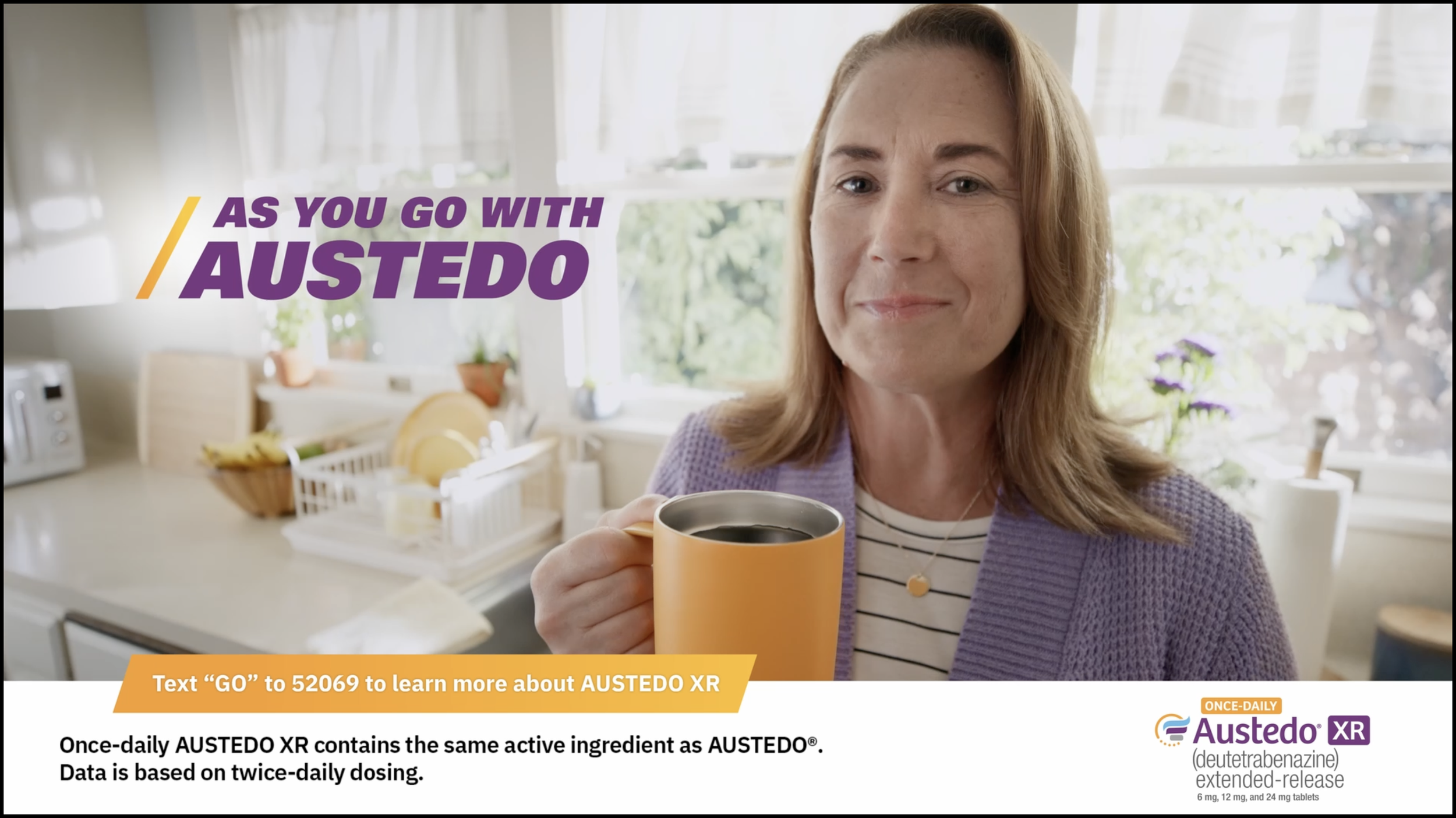
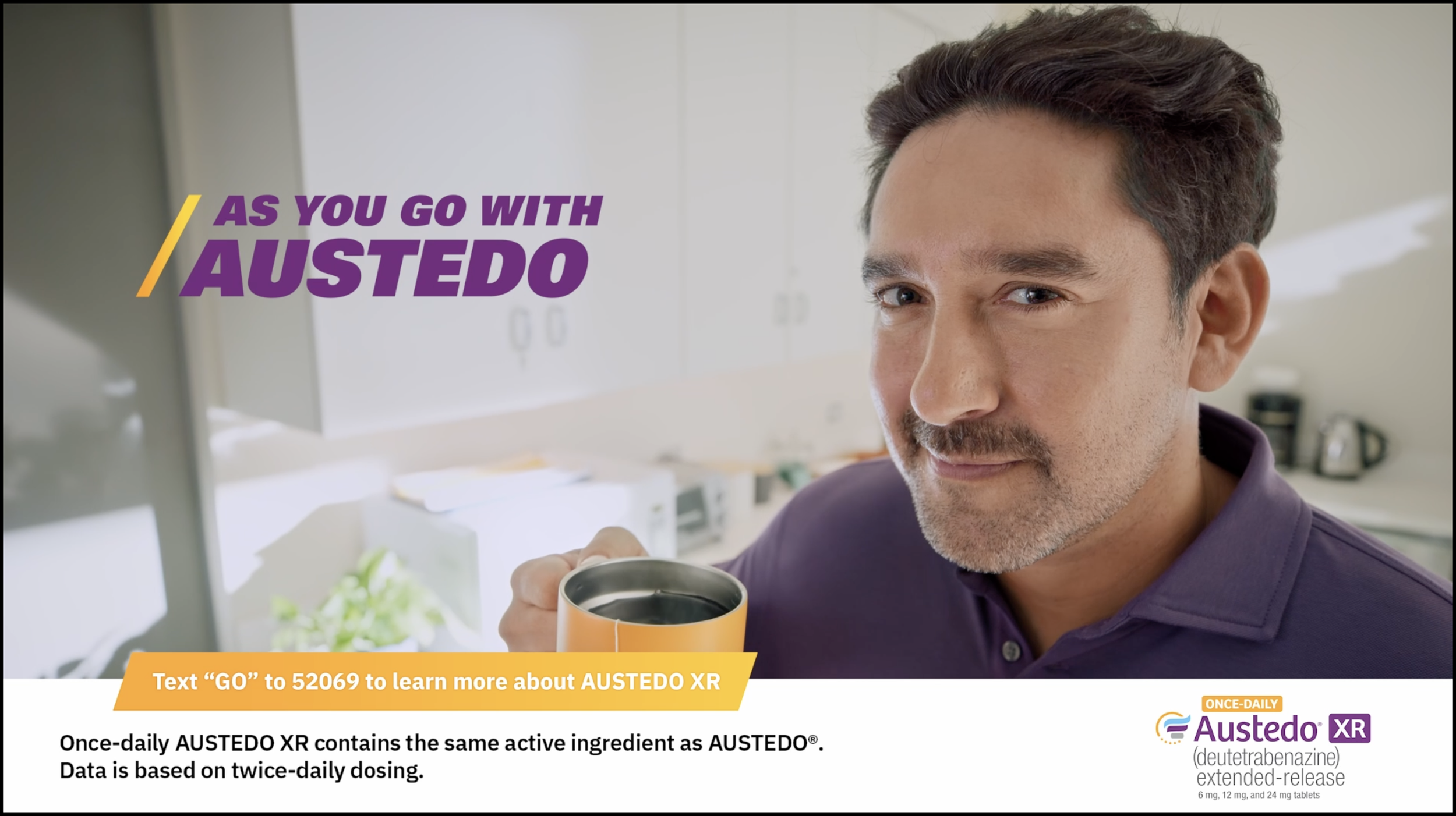
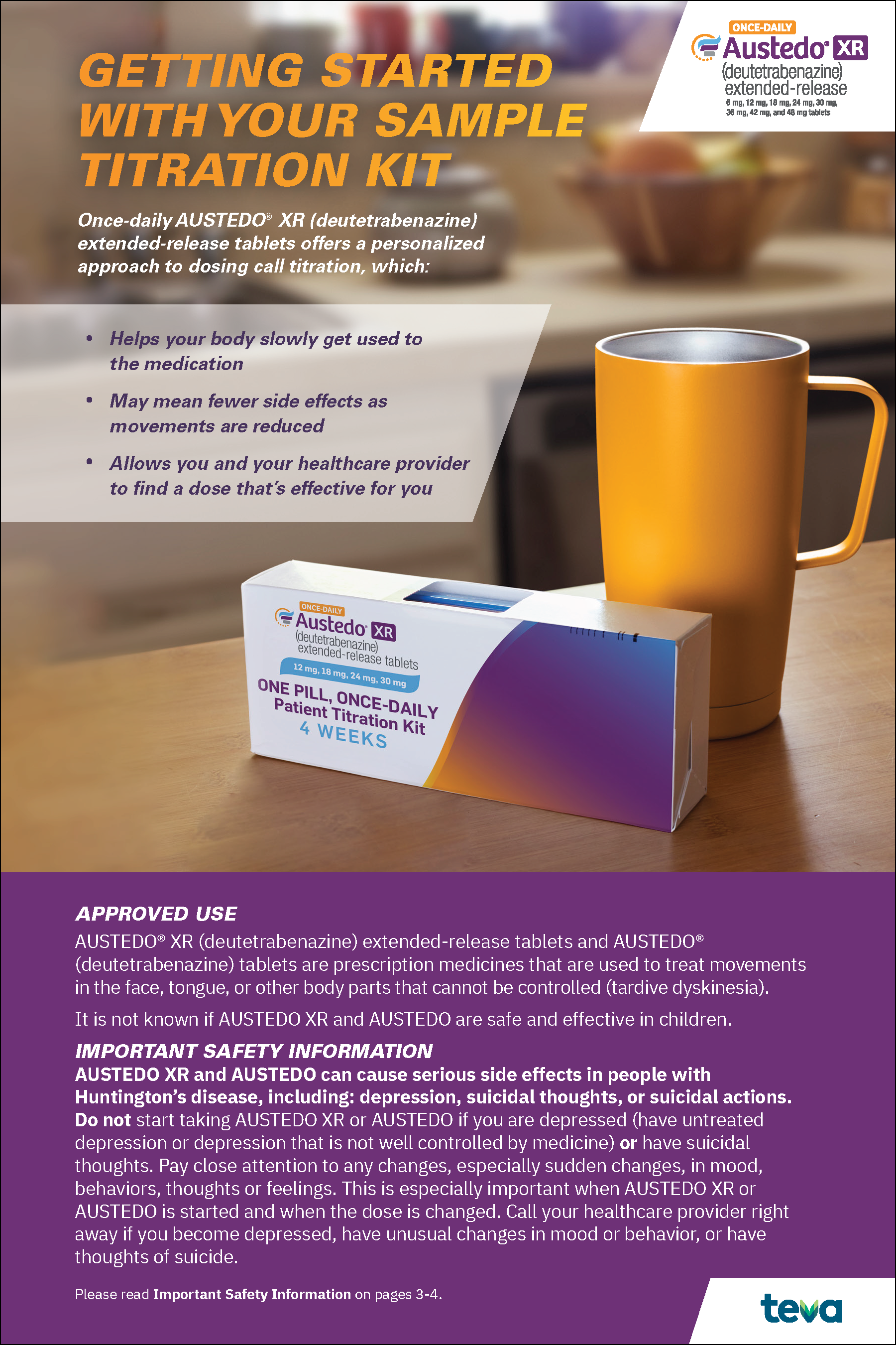
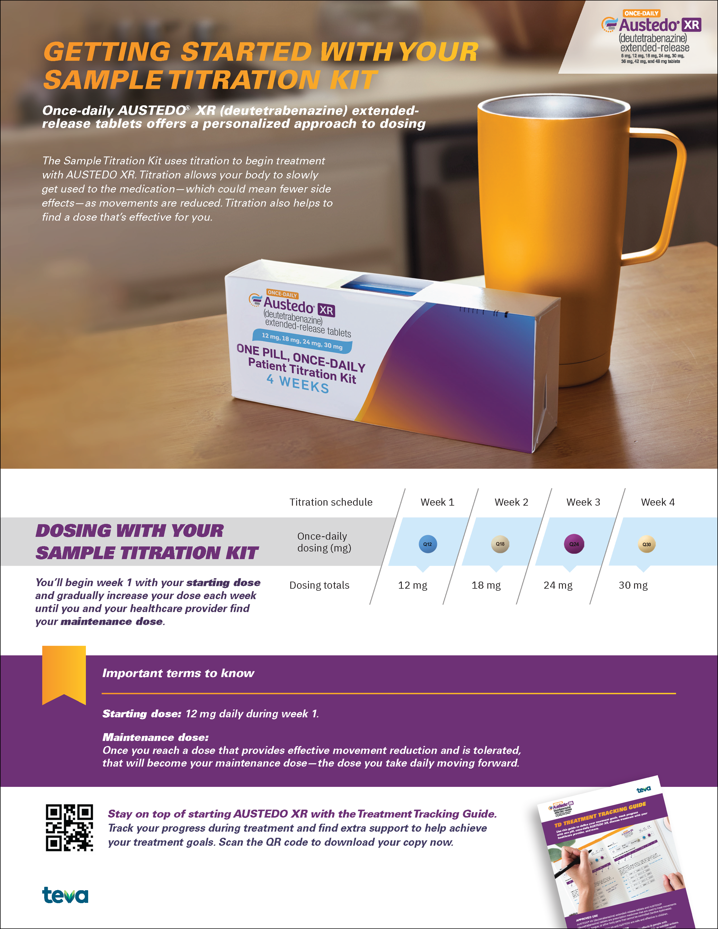
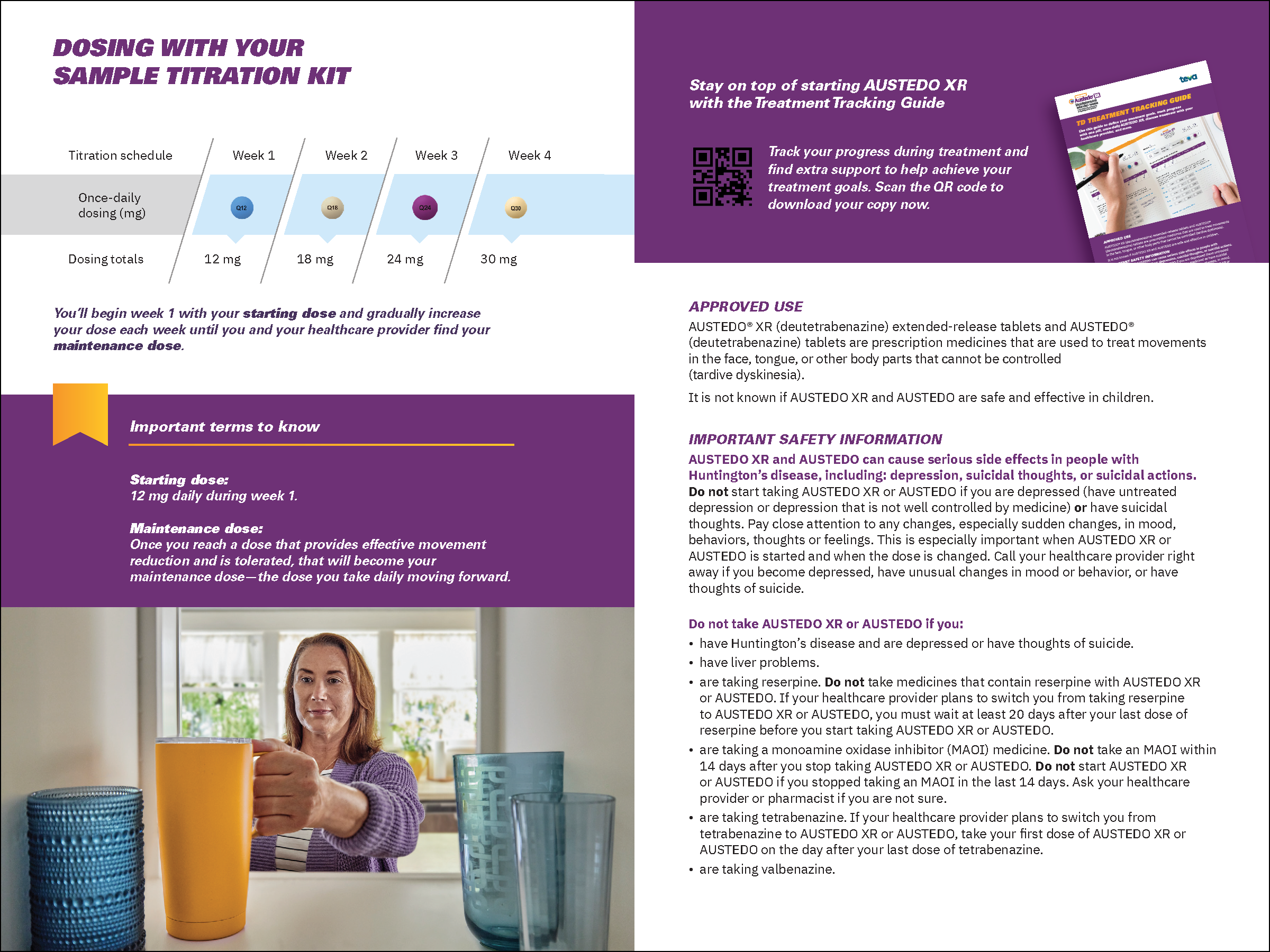
Building a brand that drives both emotional connection and measurable business results is where strategy and creativity come together. For AUSTEDO, I helped lead the development of a new integrated brand identity and national campaign spanning four 60-second TV commercials, digital video, website experience, social media, print, and comprehensive brand guidelines. The campaign successfully elevated the brand across every touchpoint while delivering exceptional performance—achieving a 28% key site activity rate from TV-to-text users (compared with a 4% annual benchmark), surpassing website traffic goals by 173% within three months, and generating 8,800 new-to-brand prescriptions in its first five months. This project showcases my ability to lead large-scale, omnichannel healthcare campaigns that combine compelling creative with measurable commercial impact.
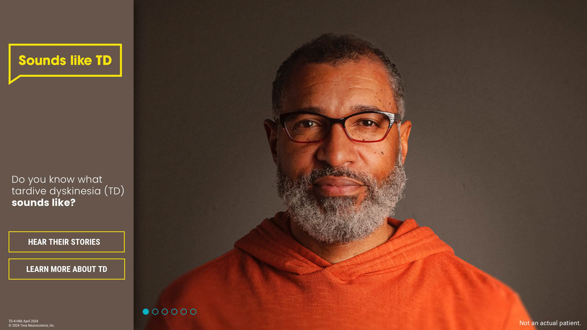
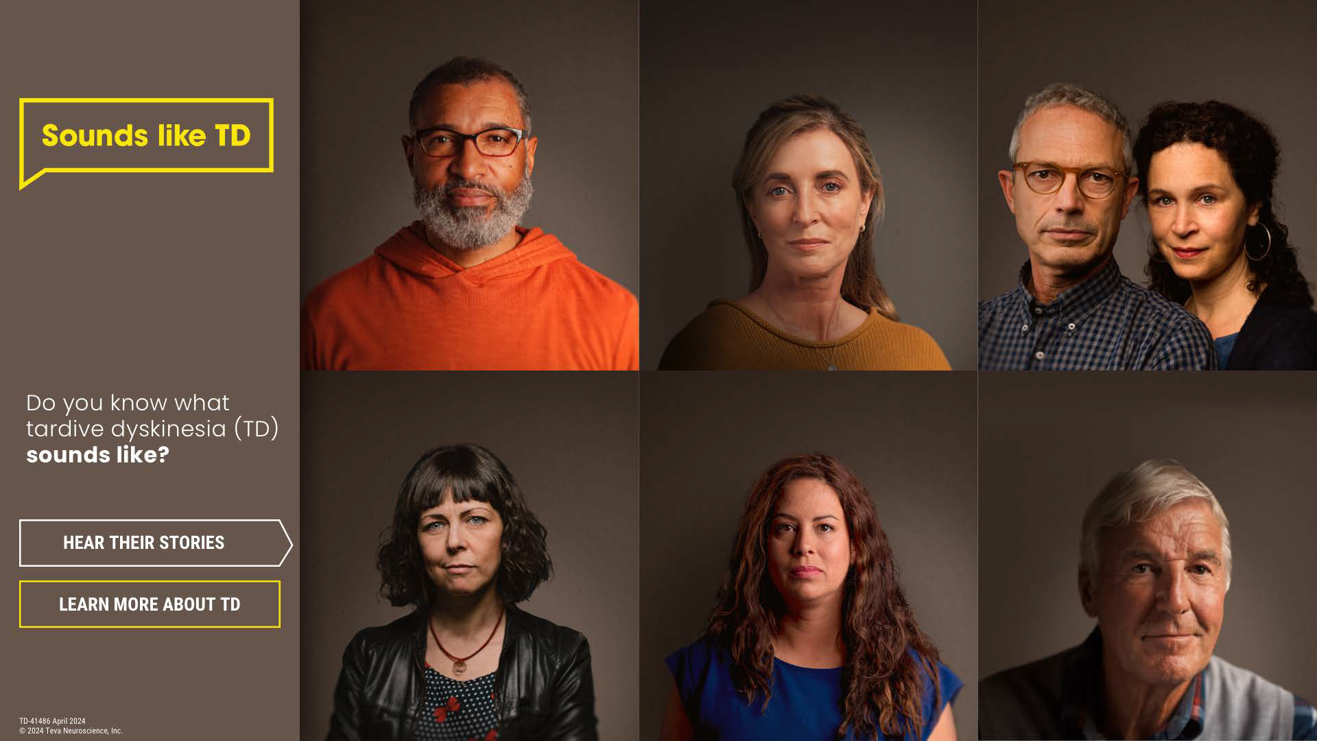
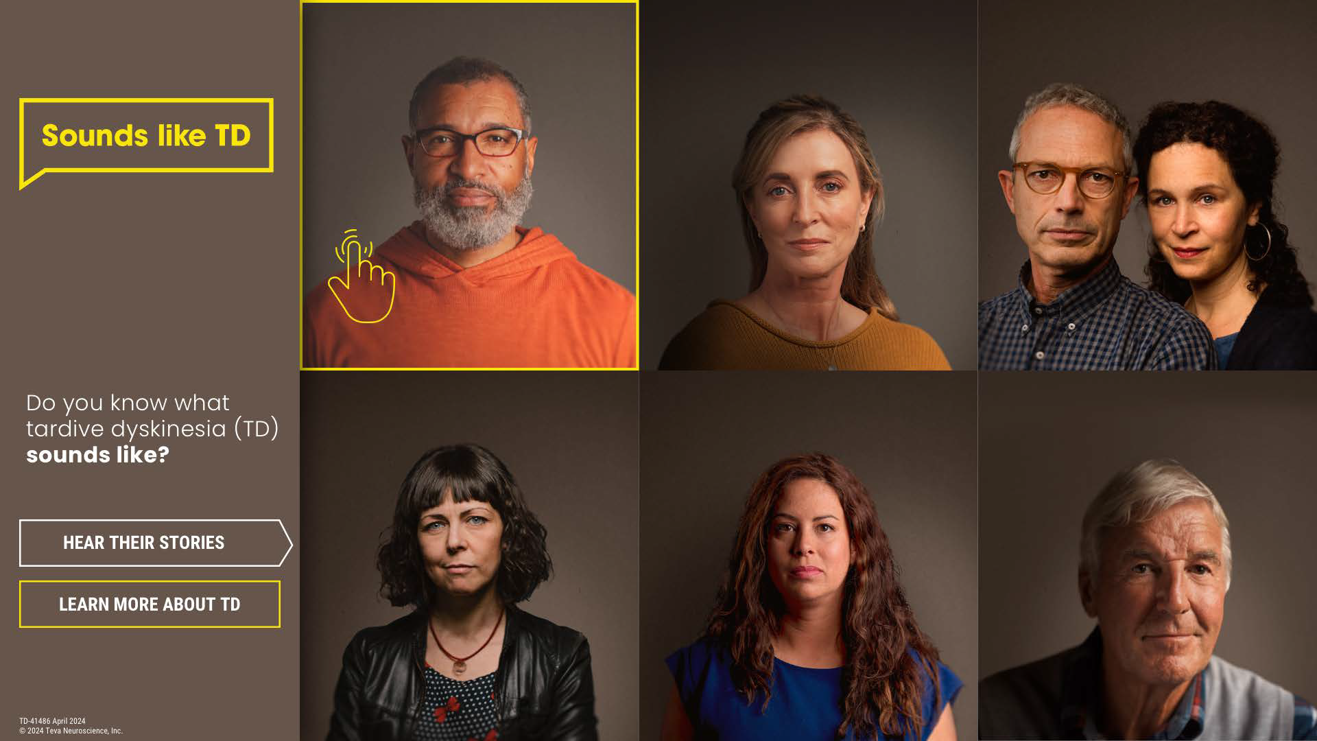
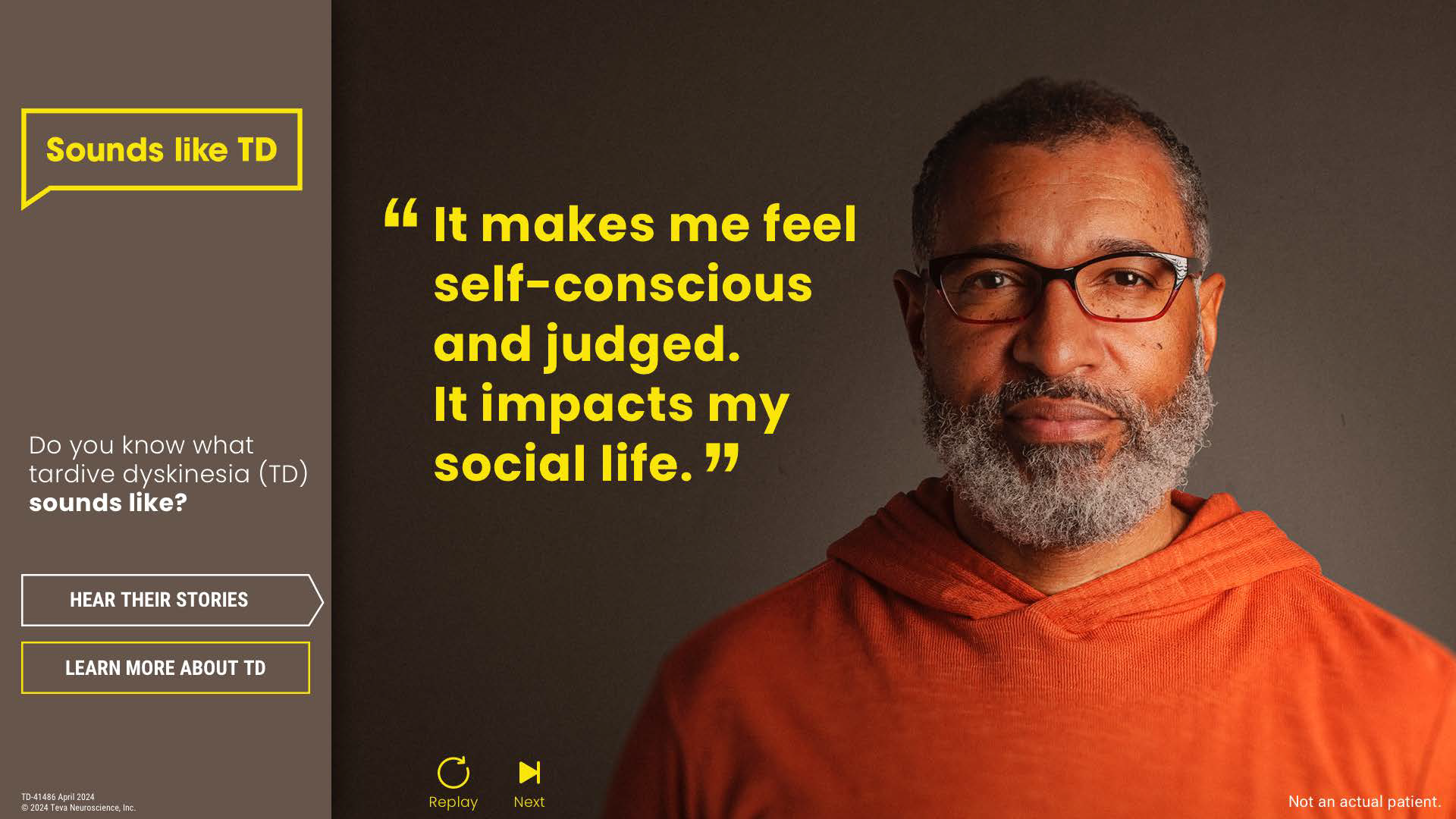
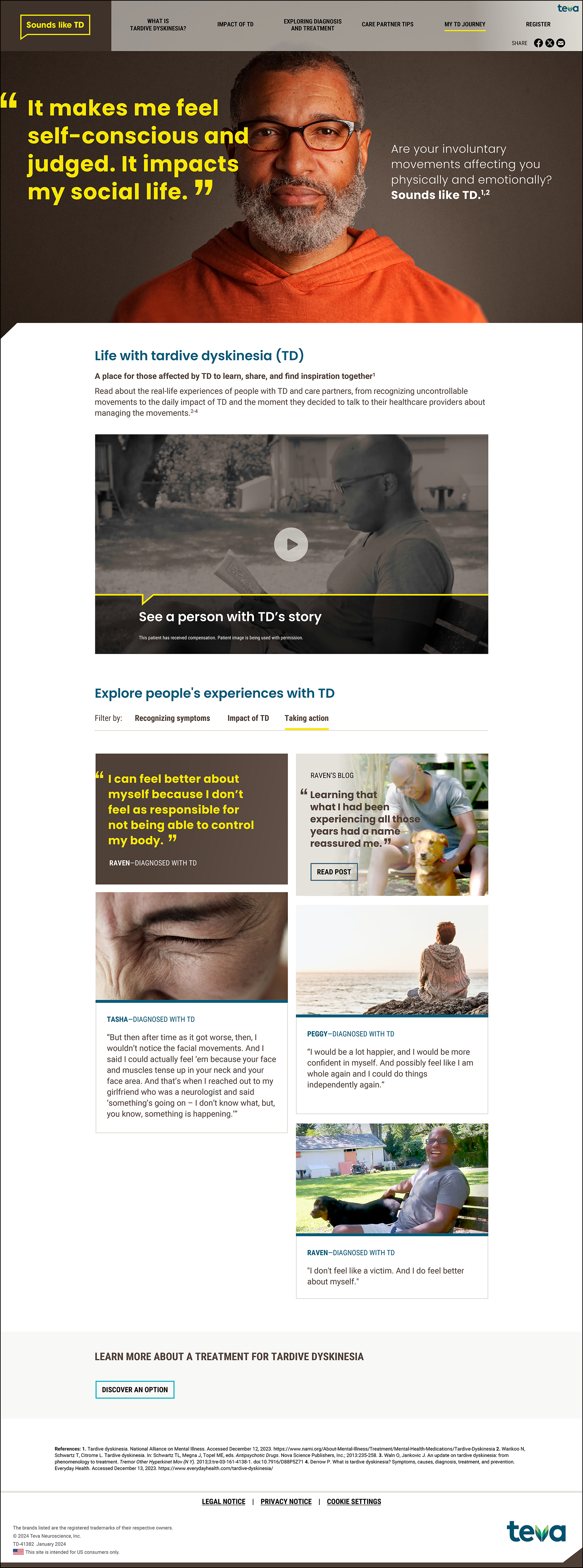
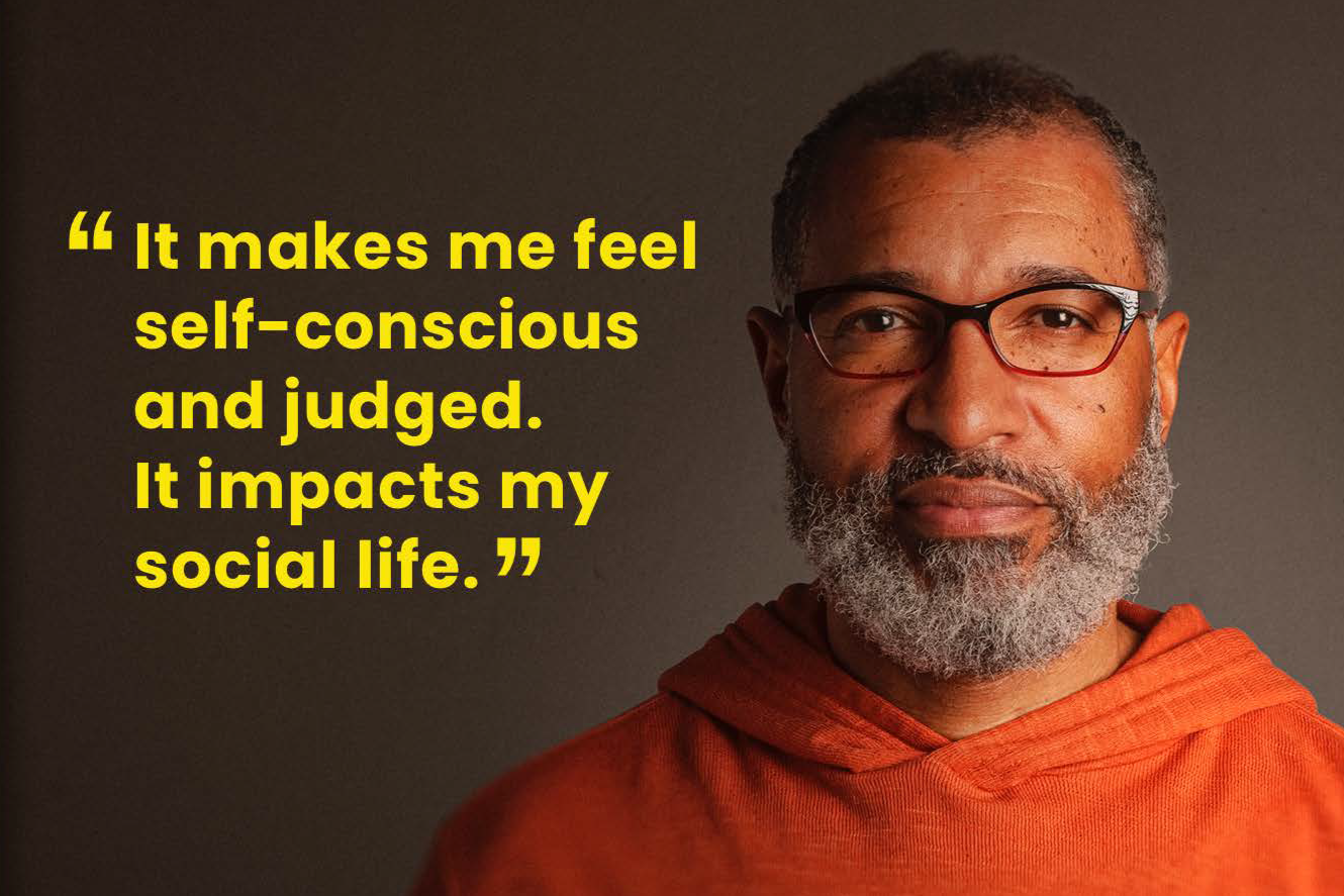
The most powerful healthcare campaigns don't sell a product—they change the conversation. For Sounds Like TD, I helped create a bold, unbranded awareness campaign that brought the realities of tardive dyskinesia to the forefront through raw, emotionally authentic patient voices that challenged stigma and encouraged recognition of the condition.
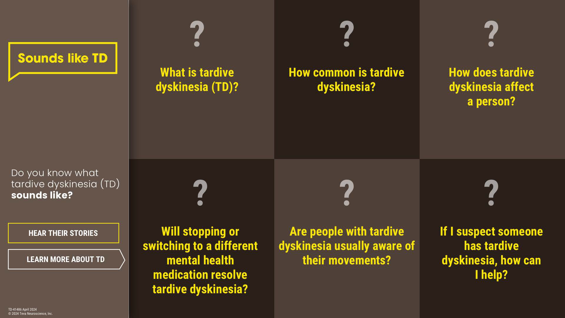
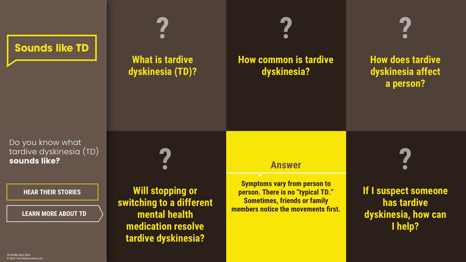
We extended the campaign into a completely new visual identity across a NAMI interactive booth experience, website, social content, and comprehensive brand guidelines, creating a cohesive platform designed to educate, foster empathy, and spark meaningful dialogue.
This project demonstrates my ability to build purpose-driven campaigns that connect deeply with audiences while transforming complex healthcare challenges into compelling brand experiences.
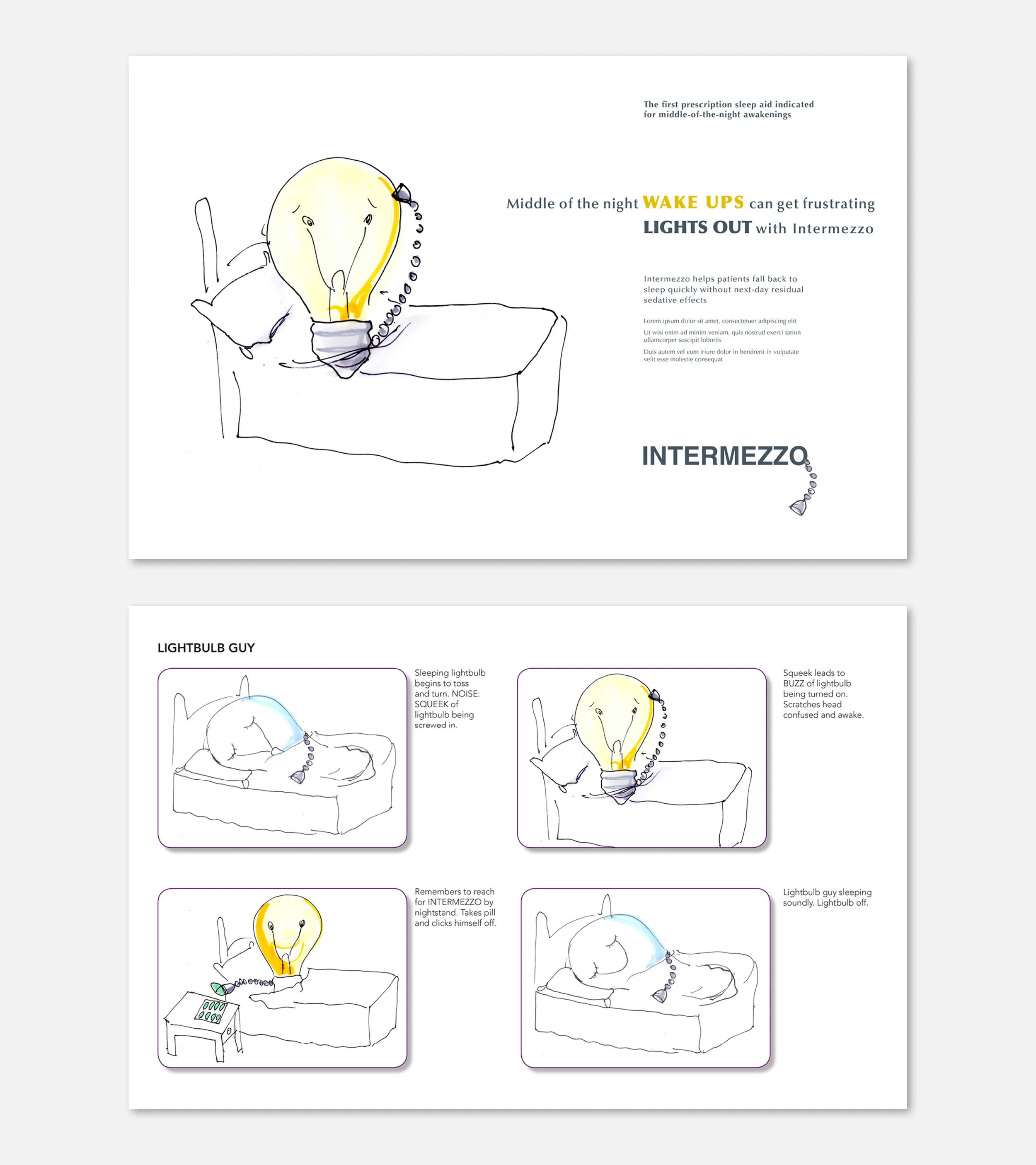
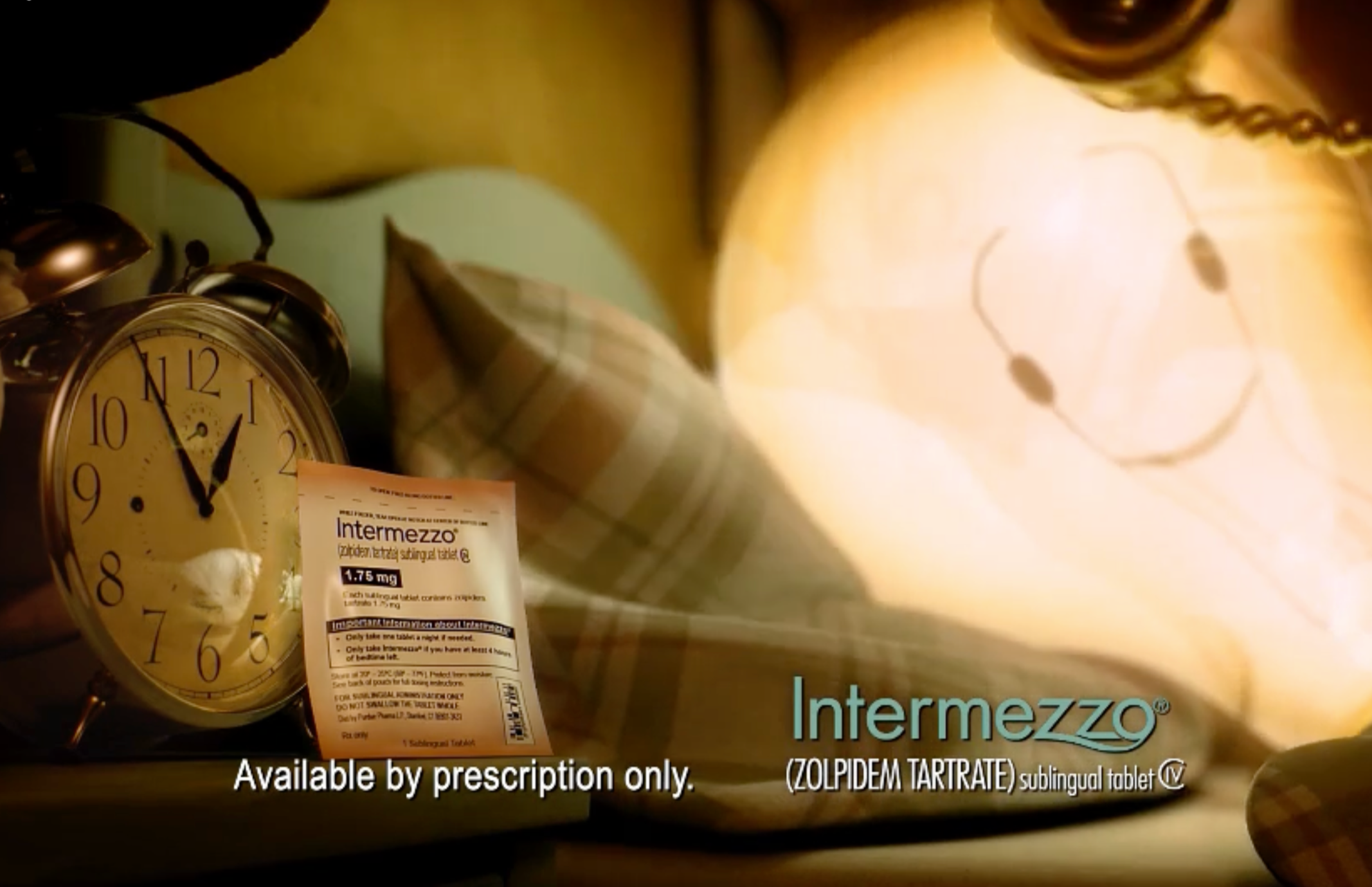
Great brands are built on ideas that are simple, ownable, and impossible to forget. I developed the original creative concept behind Intermezzo’s national brand campaign—an unexpected light bulb character that brought to life the frustration of a mind that suddenly “turns on” at 3 a.m. For a sleep aid entering a highly competitive category dominated by brands like Lunesta, Rozerem, and Ambien, this distinctive idea gave Intermezzo an immediate emotional connection and a memorable identity that clearly communicated the product’s unique role in helping people return to sleep.
The concept evolved into the foundation for the brand’s advertising and commercial platform, earning strong client recognition and an industry award nomination. This project represents my ability to uncover a powerful human insight, transform it into a breakthrough creative idea, and build a brand platform that drives recognition and impact.
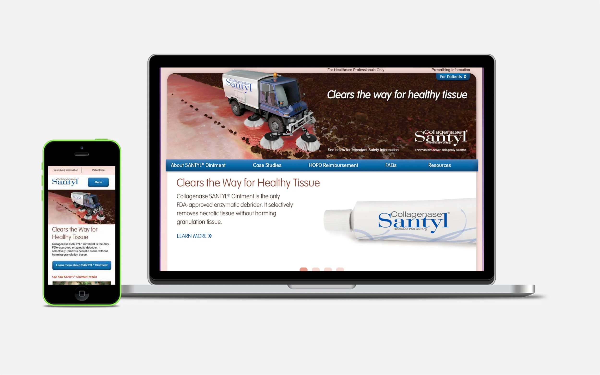
The most effective healthcare ideas transform complex science into simple, unforgettable stories. I developed the original creative concept for Santyl—a “street sweeper” visual metaphor that brought the brand’s unique mechanism of action to life by showing how it selectively clears away damaged tissue while protecting what matters most: healthy skin. In a category where wound care can feel complicated and clinical, this idea created an approachable, instantly recognizable way to communicate Santyl’s differentiated benefit.
The concept became the foundation for the brand’s creative expression, demonstrating my ability to identify a compelling human insight, translate complex medical innovation into a powerful visual idea, and build memorable brand platforms that resonate with both healthcare professionals and patients.
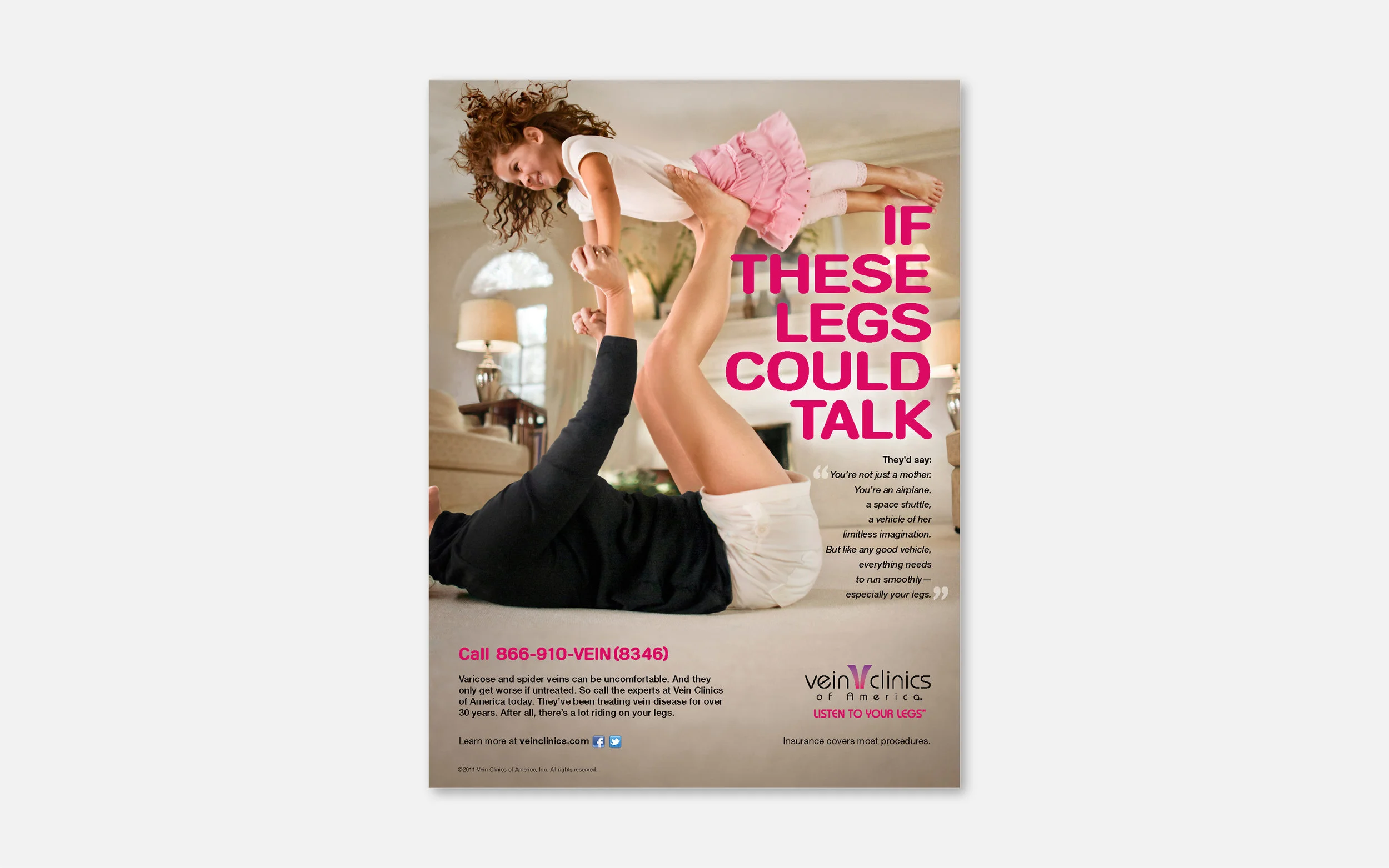
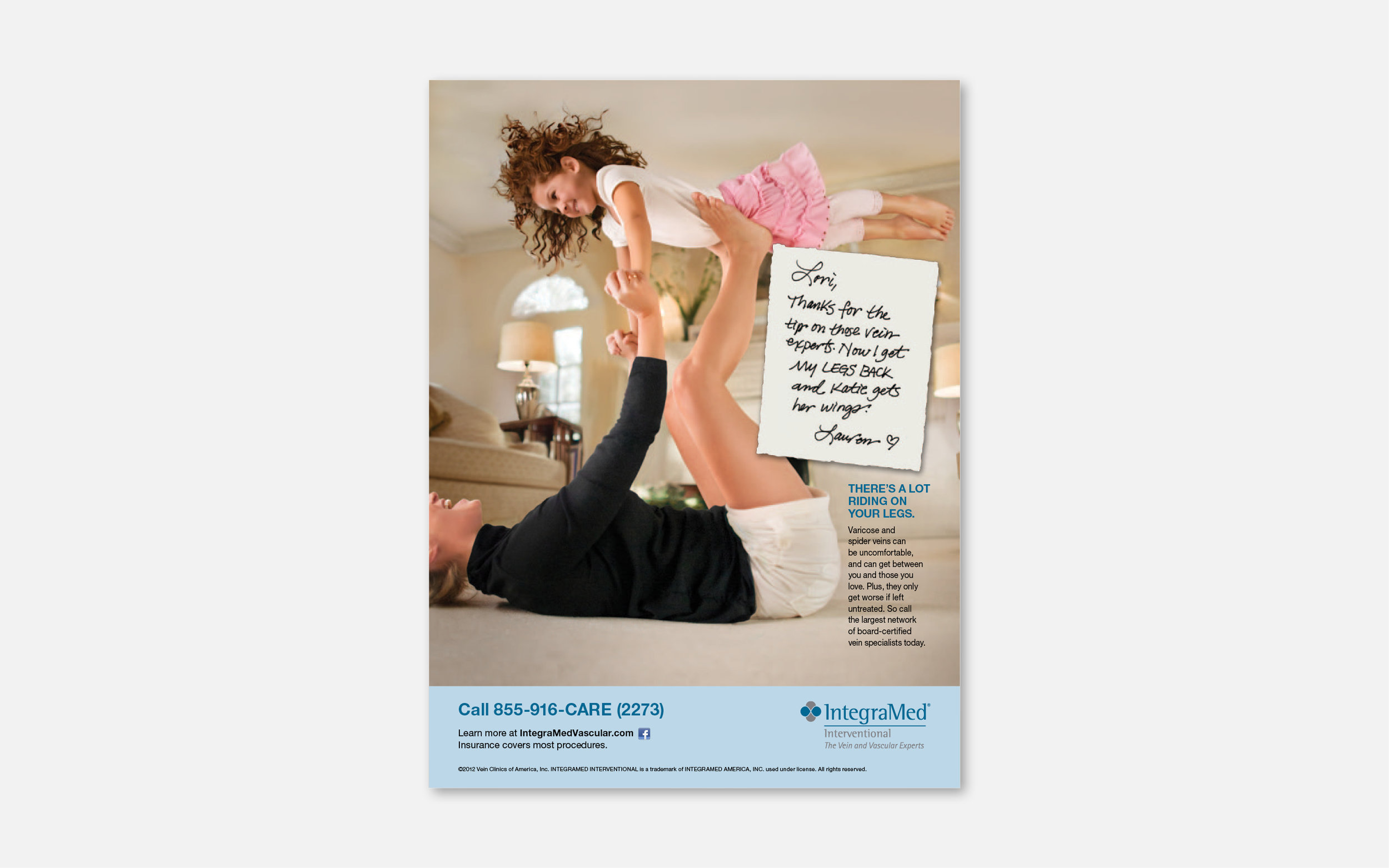
The strongest healthcare campaigns uncover the human story behind the condition. I developed the original creative concept for Vein Clinics of America’s “If These Legs Could Talk” campaign, reframing varicose veins from a surface-level cosmetic concern into a deeply personal experience shaped by physical discomfort, frustration, and emotional impact.
The idea came to life through the concepting and development of two 30-second national television commercials, guiding the creative vision from initial concept through production and post-production. By giving patients’ experiences a voice through authentic, empathetic storytelling, the campaign created a powerful emotional connection while redefining how audiences viewed the condition and the importance of treatment.
The platform aired nationally and earned multiple industry awards, showcasing my ability to uncover a compelling human insight, translate it into a memorable brand idea, and lead a concept through full-scale execution.
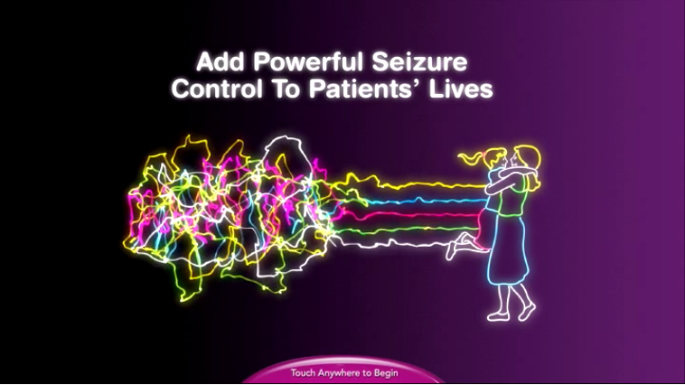
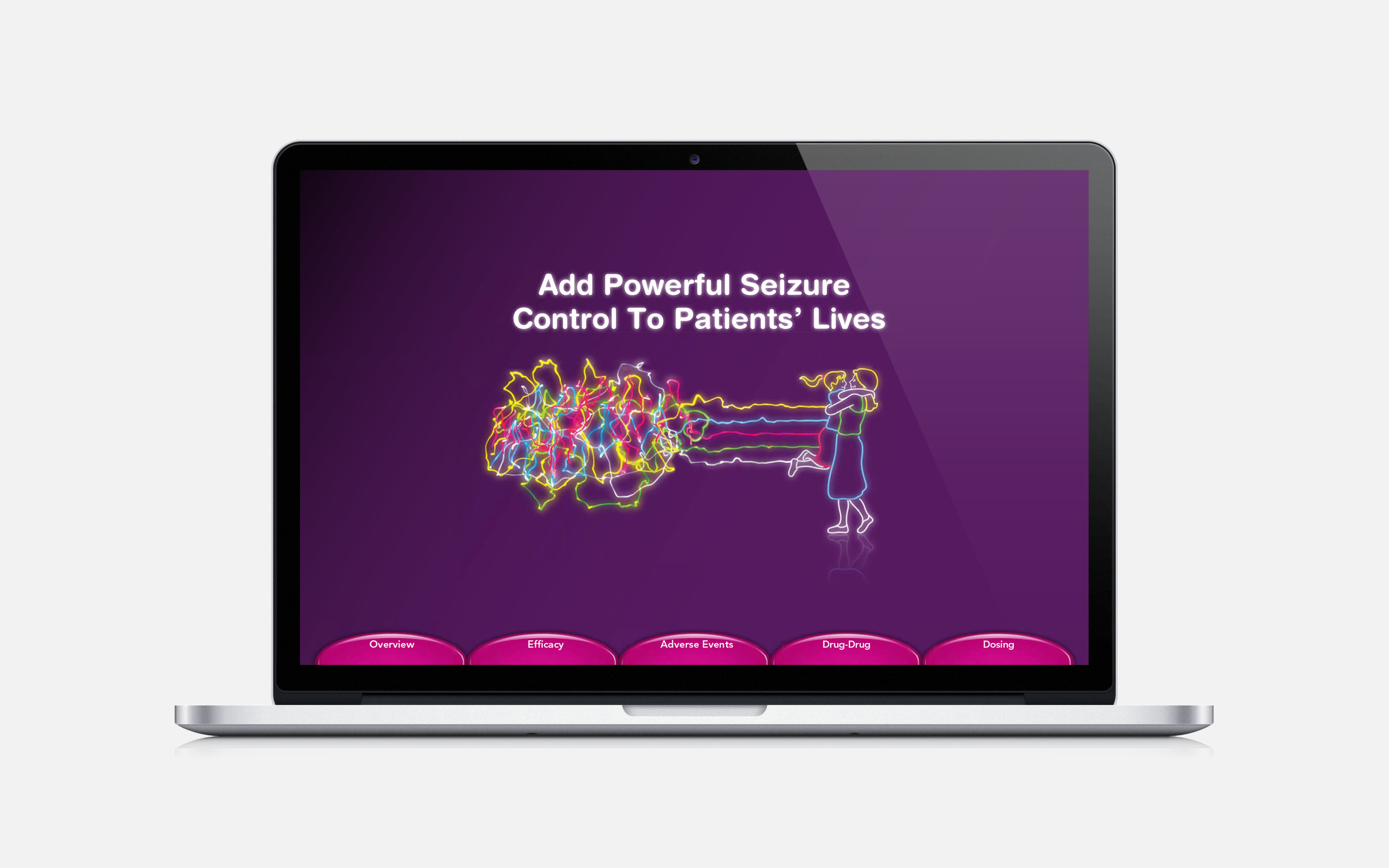
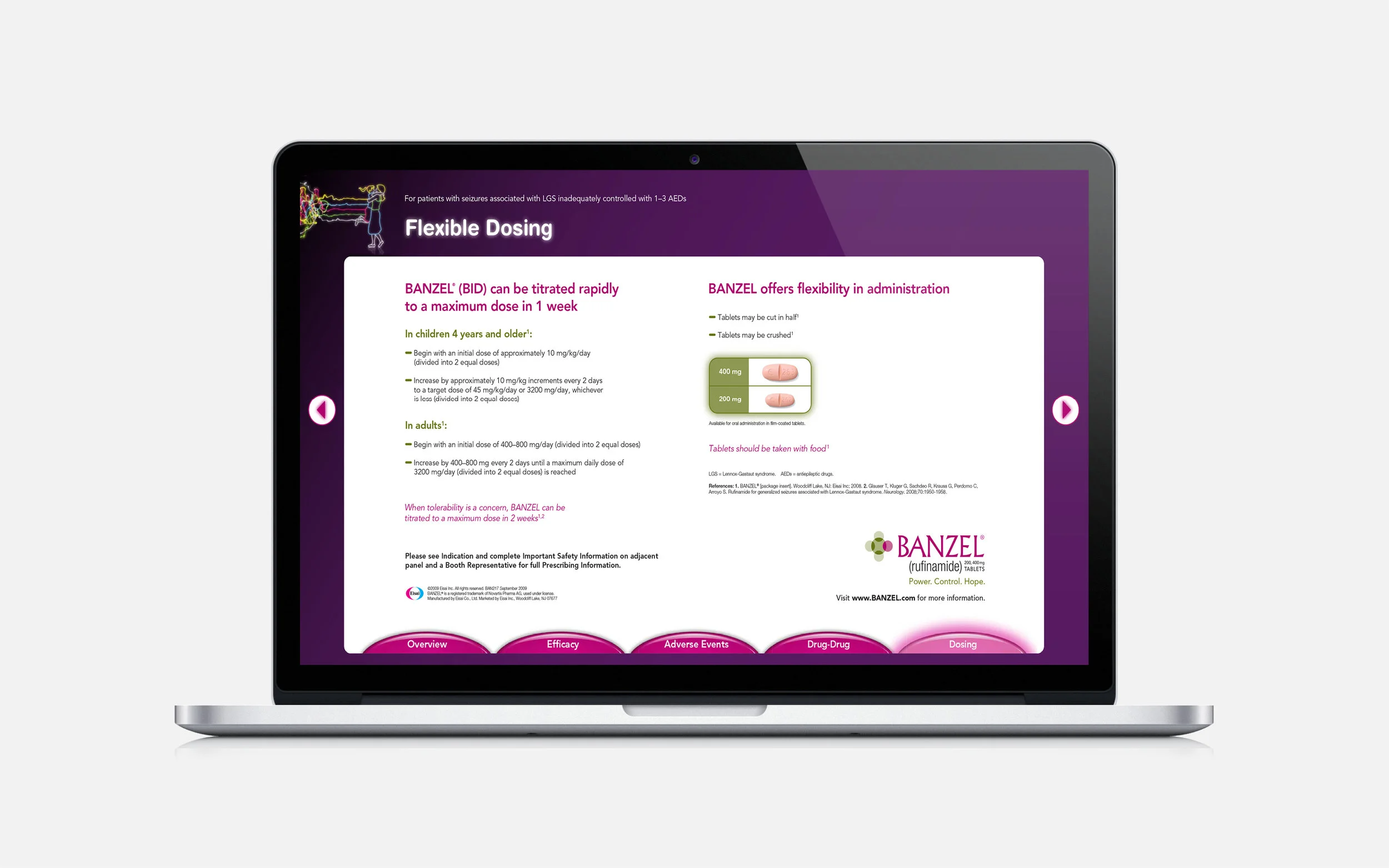
For families living with Lennox-Gastaut Syndrome (LGS), seizures can be severe, unpredictable, and incredibly difficult to control. Our client needed a campaign that communicated both the clinical benefit of treatment and the emotional hope that comes with greater seizure control.
The creative concept transformed chaotic electrical brain waves into a calmer, more normalized EEG pattern that subtly formed the image of a mother and child embracing. By blending science with emotion, the campaign created a powerful visual expression of connection, protection, and hope for families navigating the challenges of LGS.
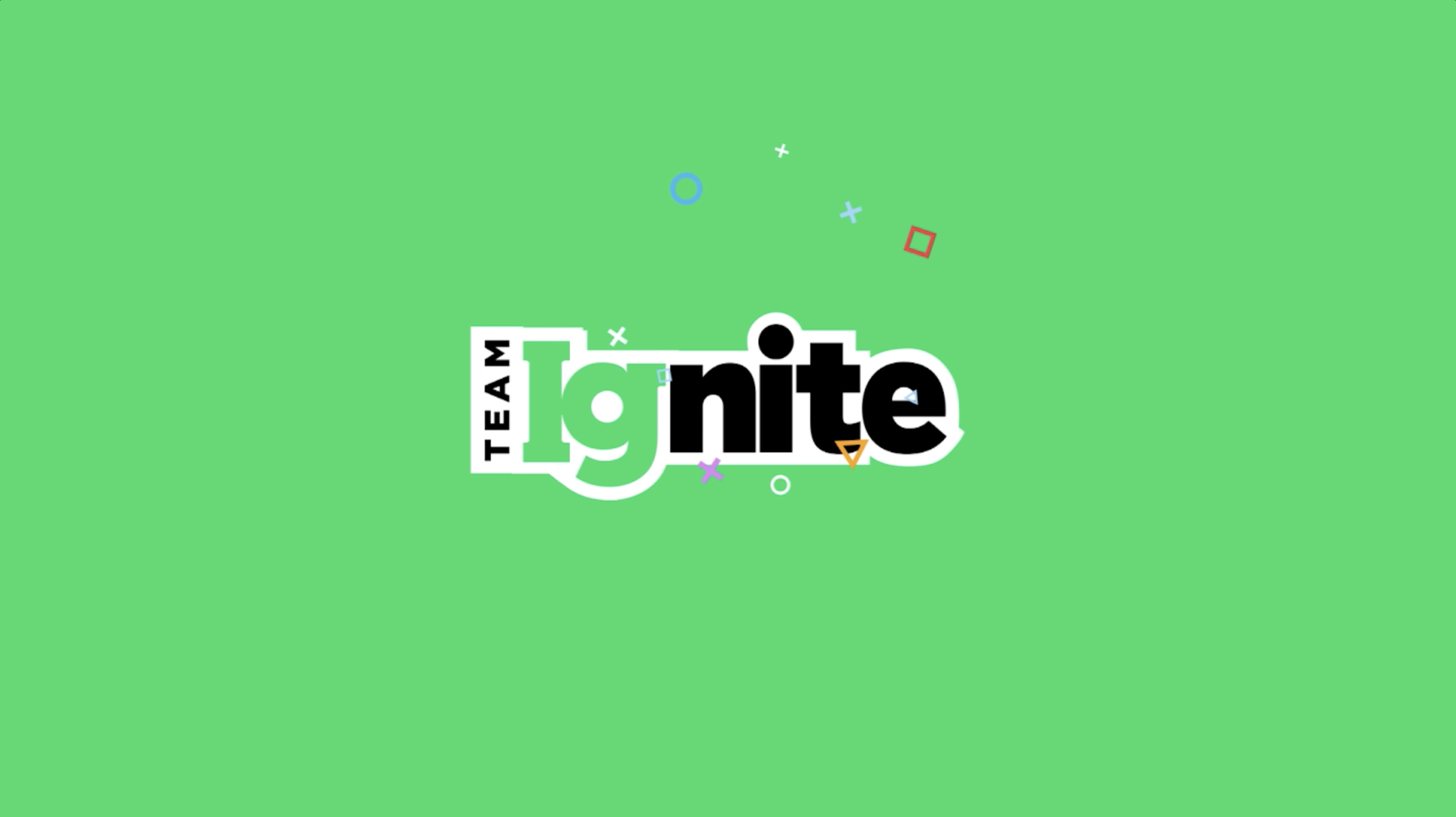
Great pitches don’t just present ideas—they create belief, energy, and momentum around a vision. When invited to pitch for Takeda’s Immunoglobulin (Ig) business, I created the “Team Ignite” identity to bring the opportunity to life with the ambition and excitement the brand deserved.
I developed the original concept, logo, and art direction for the pitch video experience, creating a bold visual platform that unified the team and elevated the story behind the work. The result was a high-energy, memorable presentation that generated enthusiastic client response and helped the team stand out in a highly competitive pitch environment.
This project reflects my ability to build compelling brand identities, inspire teams around a shared vision, and create experiences that make ideas more powerful and persuasive.
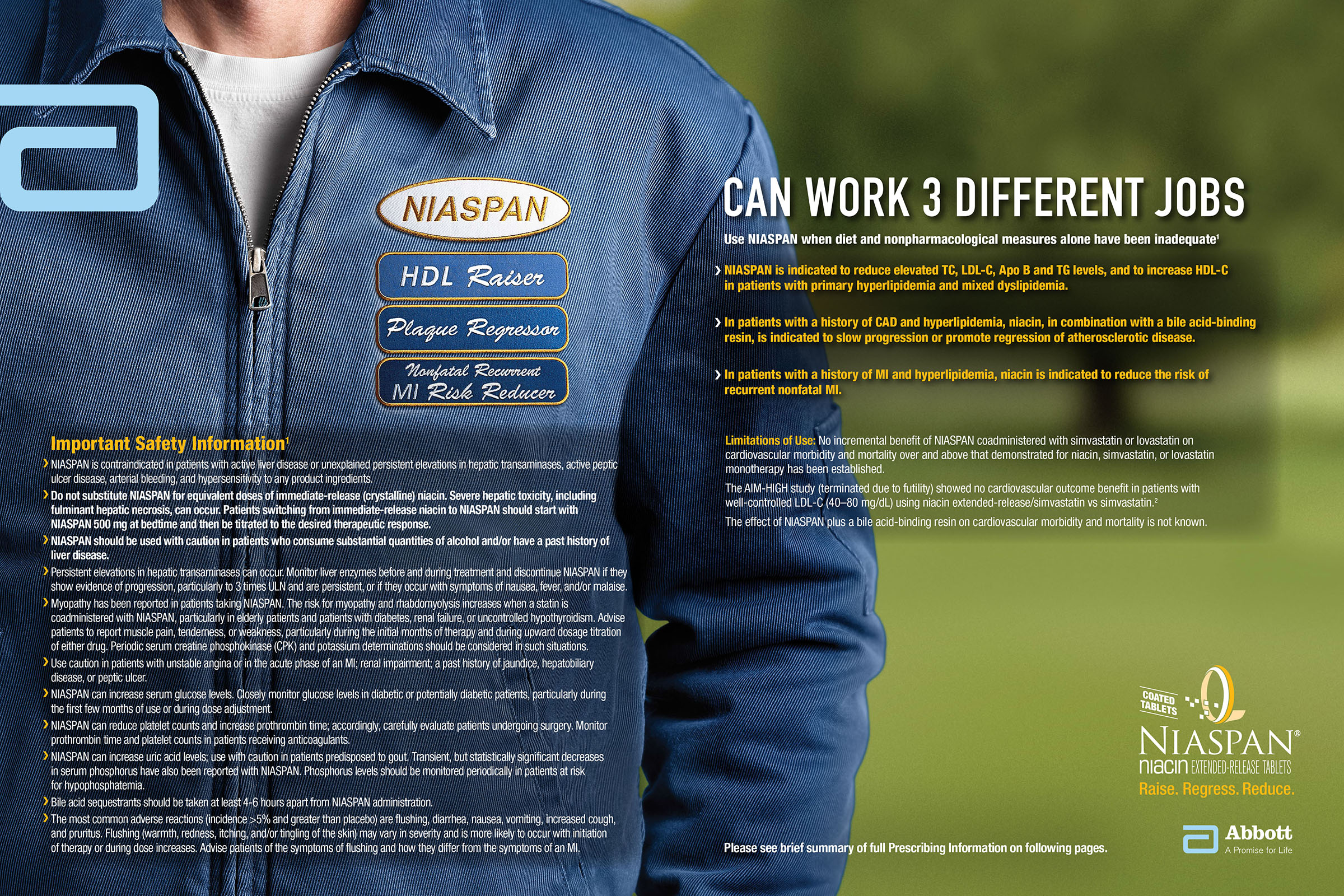
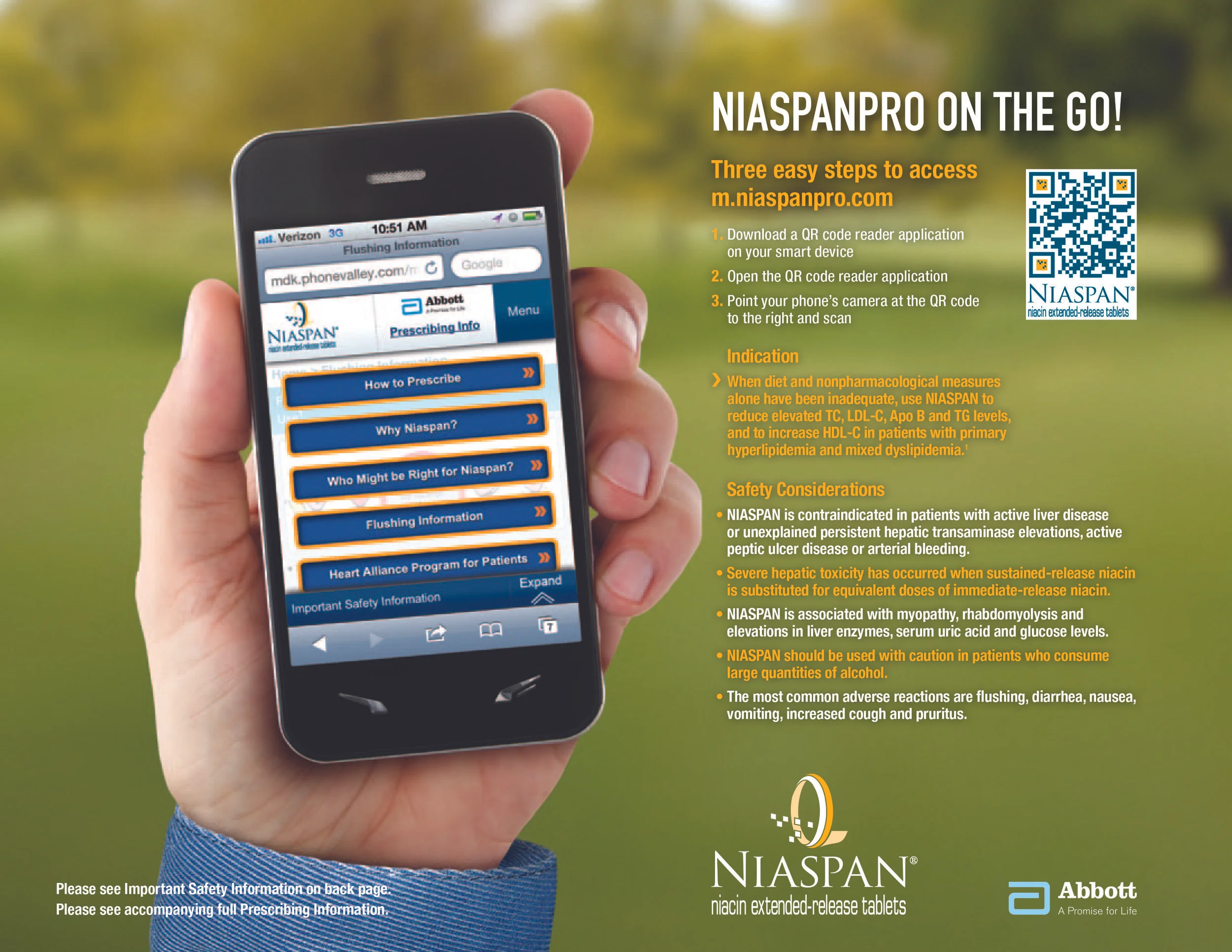
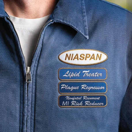
The best healthcare ideas simplify complexity without losing meaning. I developed the original creative concept for NIASPAN, creating a memorable “tool man” character to bring the product’s multi-mechanism clinical benefit to life.
The idea transformed a complicated cholesterol story—raising HDL (“good”) cholesterol while lowering LDL (“bad”) cholesterol and triglycerides—into a simple, instantly recognizable visual system showing three distinct actions working together.
By turning a complex mechanism of action into an approachable and engaging brand metaphor, this concept helped make the science easier to understand while creating a distinctive creative platform that strengthened brand recognition and communication.
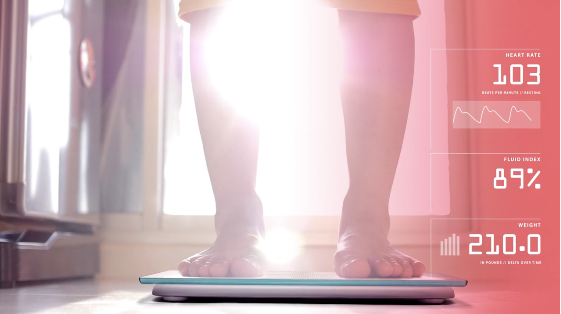
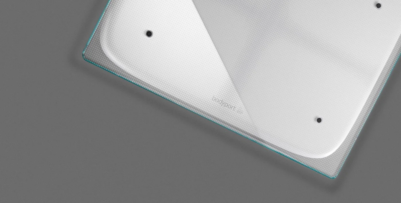
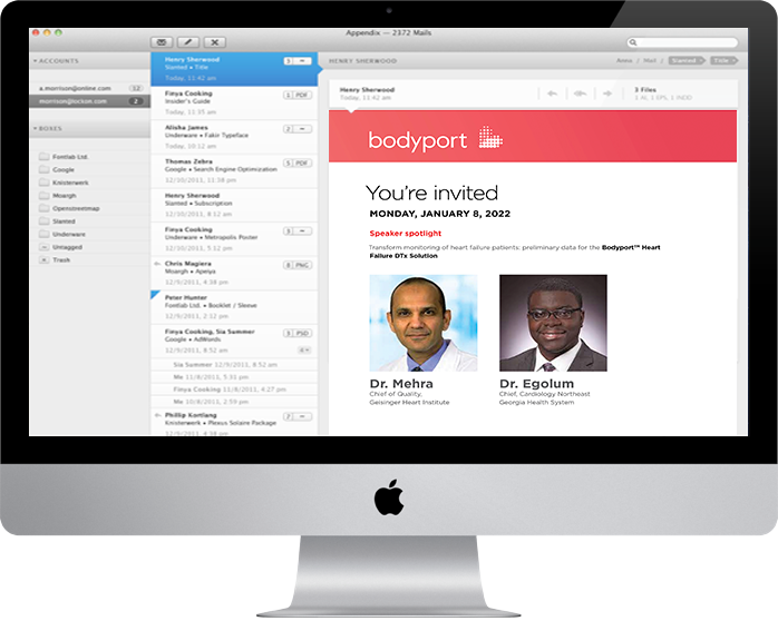
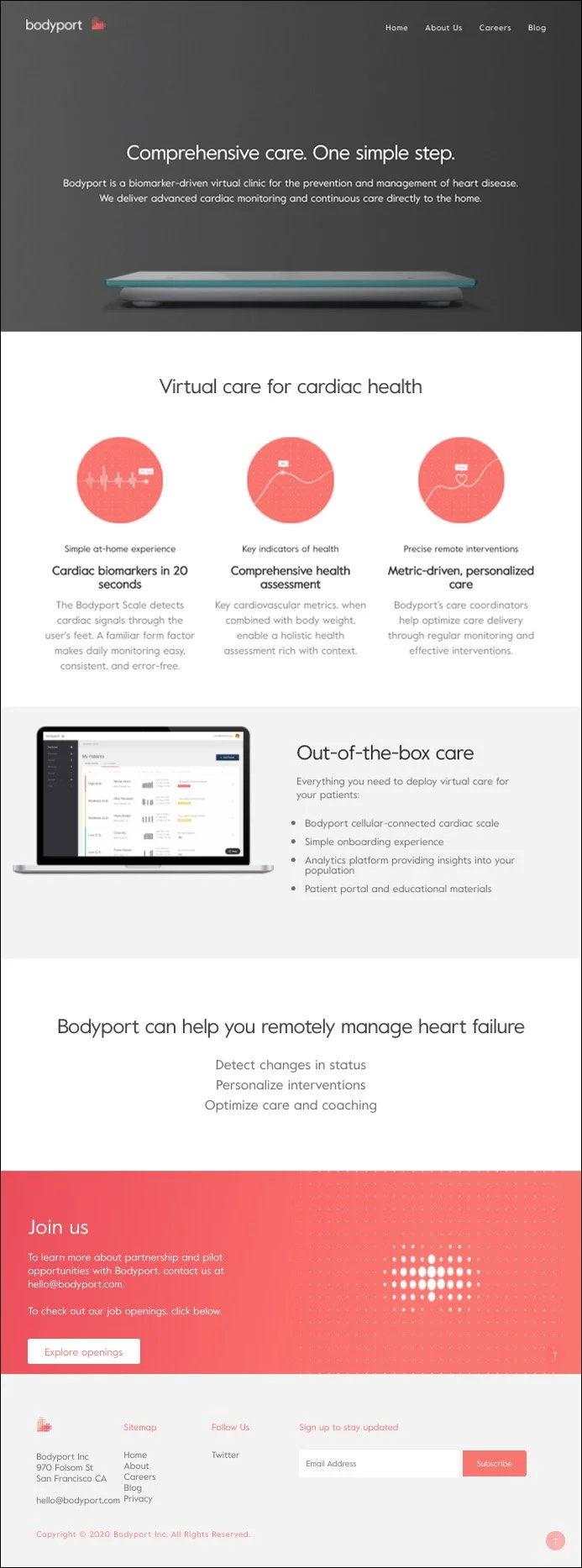
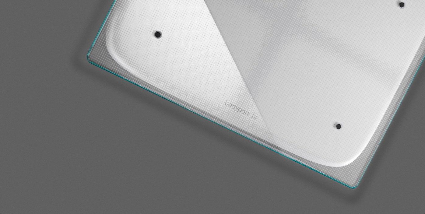
Transforming the future of healthcare requires a brand that can make complex innovation feel accessible, credible, and human. I led the creative evolution of Bodyport, helping redefine the brand experience for an at-home cardiac care platform focused on prevention, early detection, and continuous heart health management.
Through the development of a refined visual identity system, website experience, investor presentation, and high-impact sizzle video, we translated advanced biomarker technology and virtual care capabilities into a clear, compelling story.
This work showcased my ability to build brands from the ground up, simplify complex healthcare innovation, and create strategic creative experiences that inspire confidence among patients, providers, and investors.
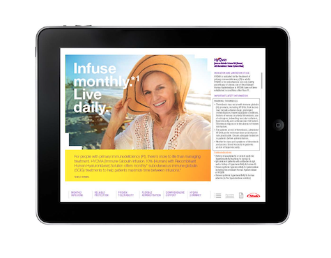
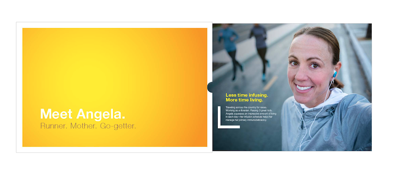
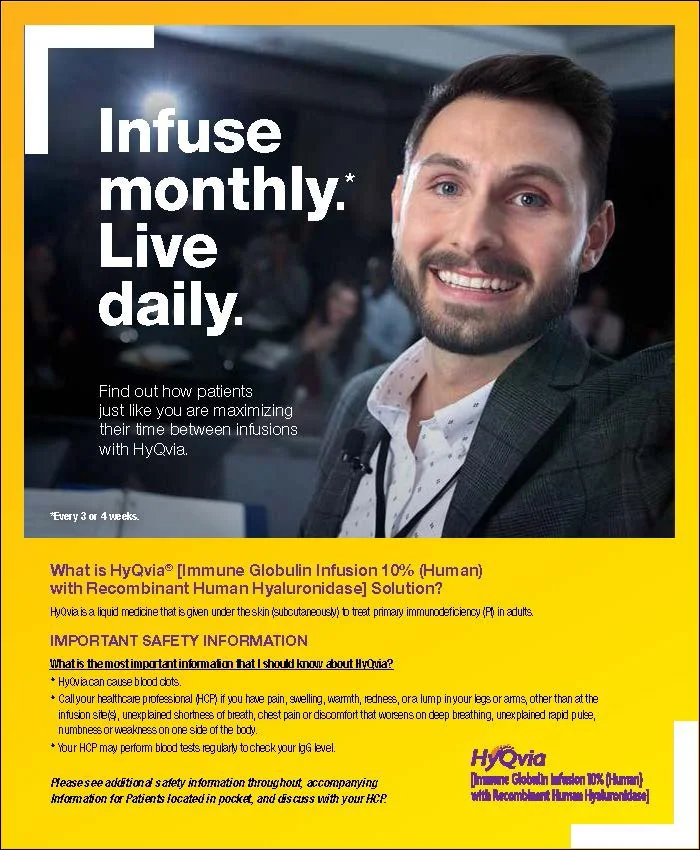
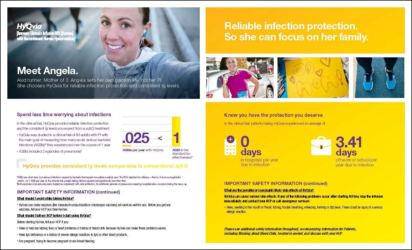
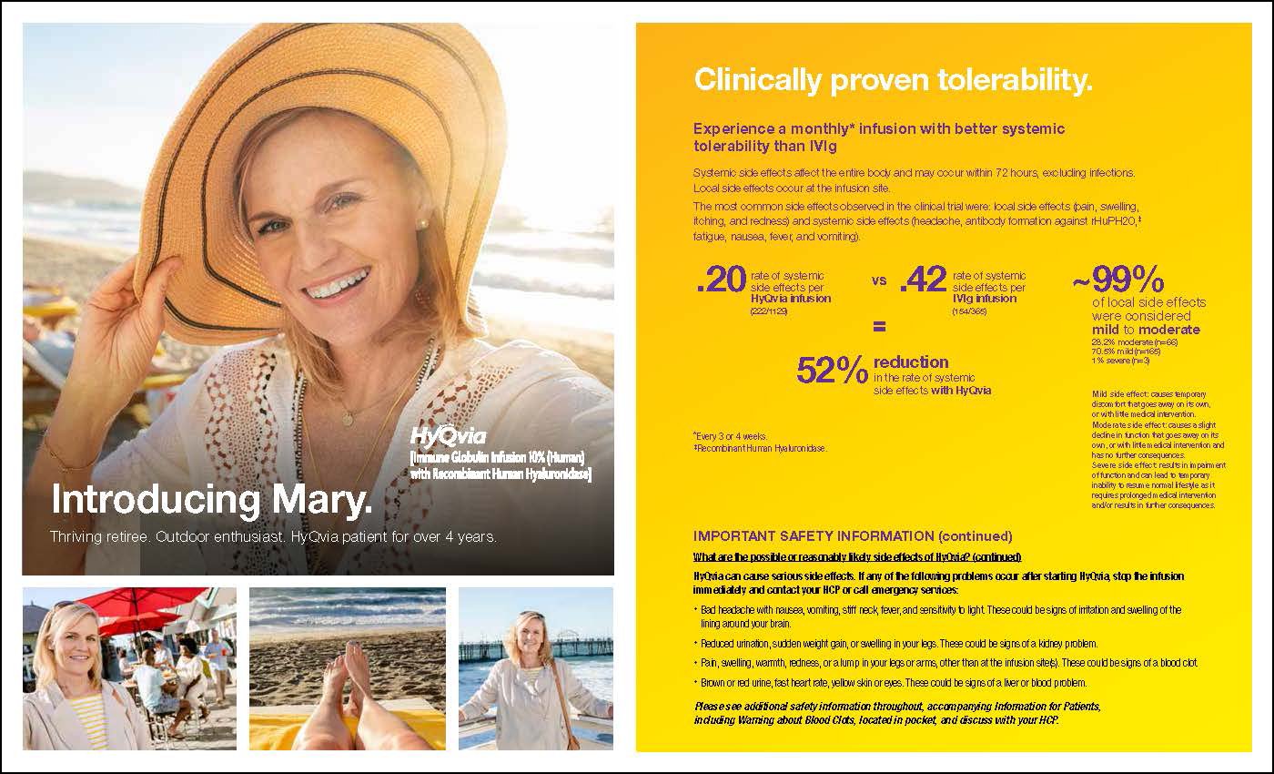
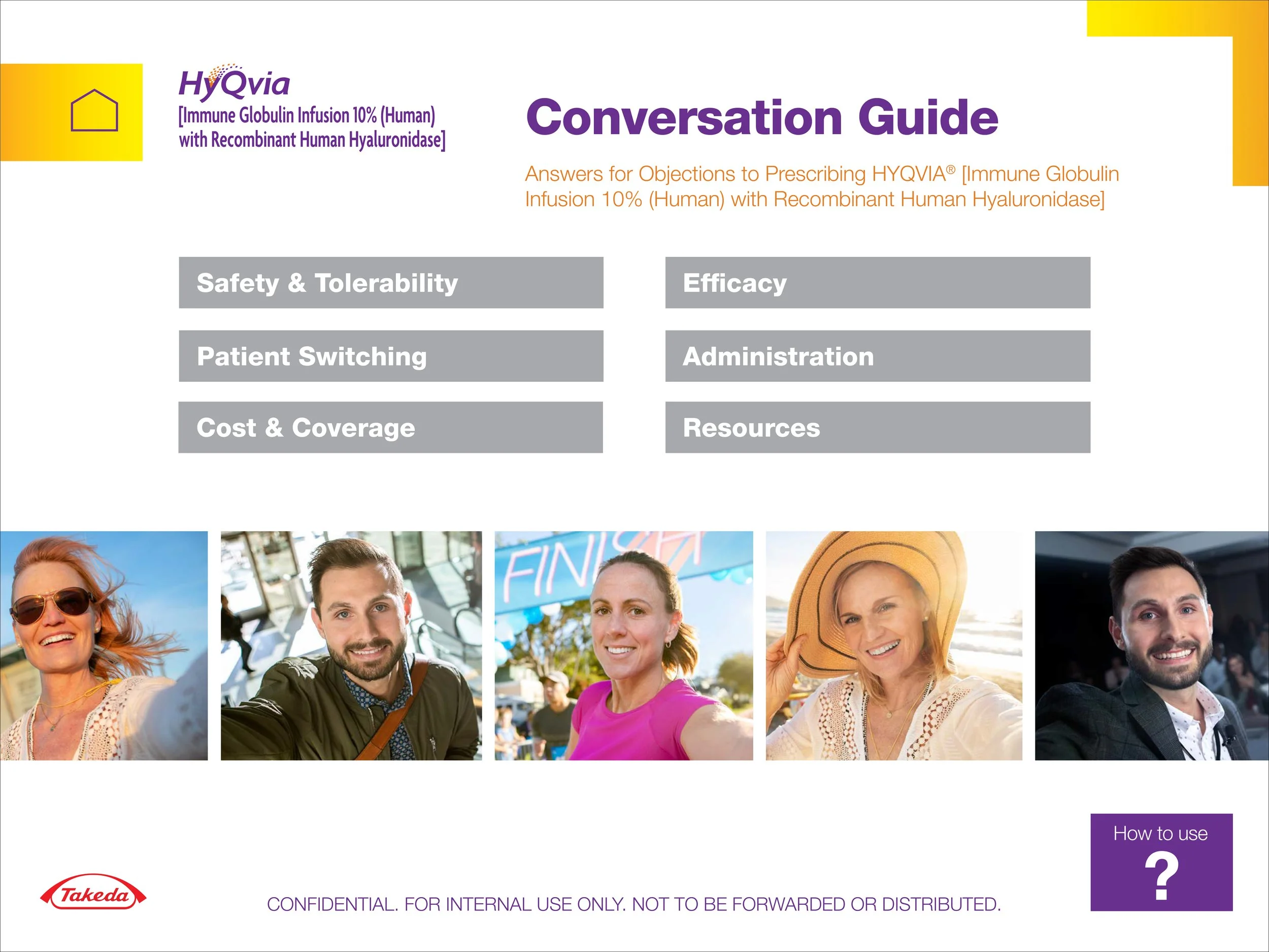
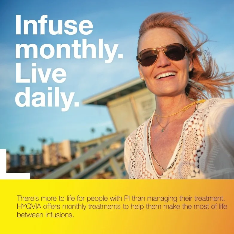
The most powerful healthcare storytelling puts patients—not the condition—at the center of the conversation. I developed the creative concept for HyQvia’s “Selfie” campaign, an authentic patient-driven platform designed to showcase the freedom and confidence that comes with a once-monthly subcutaneous immunoglobulin treatment for adults living with primary immunodeficiency (PI).
By embracing self-captured photography and real patient perspectives, the campaign shifted the narrative from managing a chronic condition to celebrating the moments, identities, and experiences that define life beyond treatment.
This work demonstrated my ability to uncover meaningful patient insights, create emotionally resonant brand platforms, and translate complex healthcare benefits into human stories that build connection and trust.
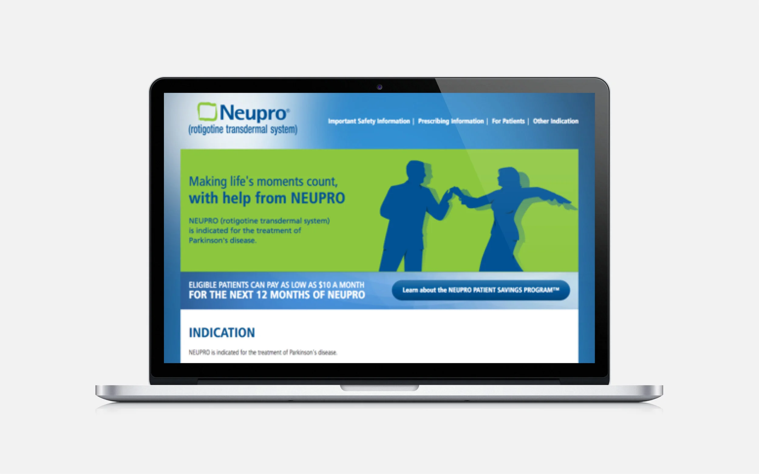
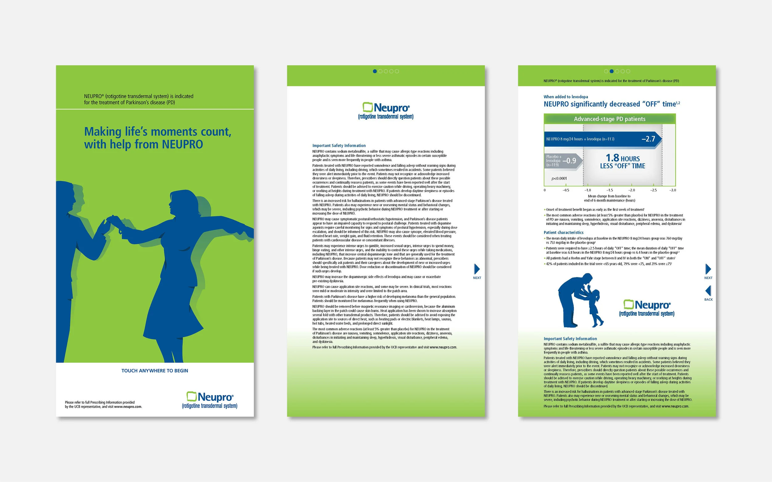
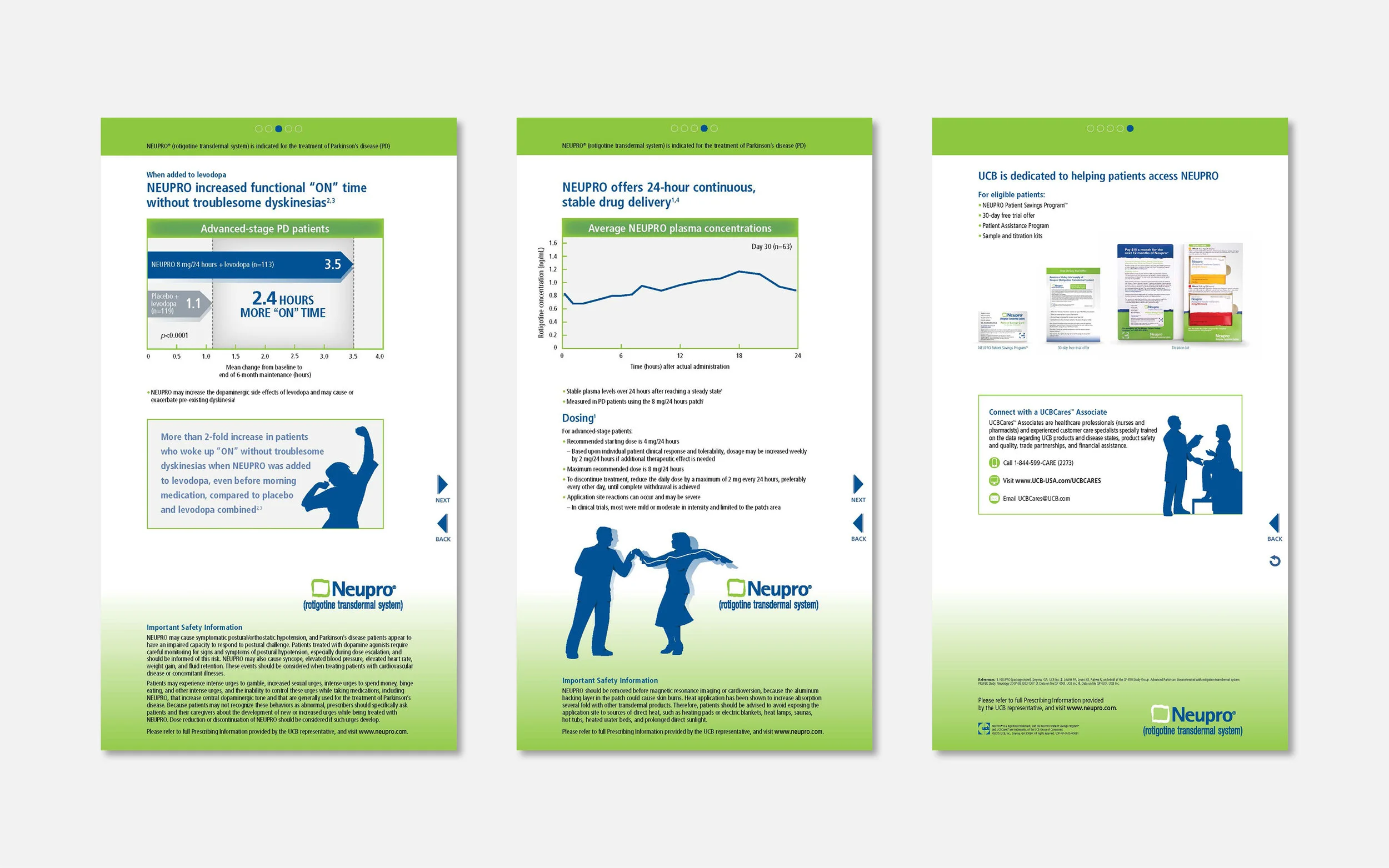
Great healthcare creative turns complex science into a message people understand instantly. For Neupro, a once-daily transdermal patch that delivers continuous dopamine therapy for Parkinson's disease and Restless Legs Syndrome, I helped develop a campaign centered on one of its strongest clinical differentiators: consistent 24-hour symptom control. Using the silhouette of a dancing couple integrated with the therapy's steady plasma concentration curve, we transformed a technical clinical benefit into a simple, emotionally resonant visual story. The campaign demonstrated my ability to distill complex medical concepts into memorable, strategically driven creative that strengthens brand positioning while connecting with healthcare professionals and patients alike.
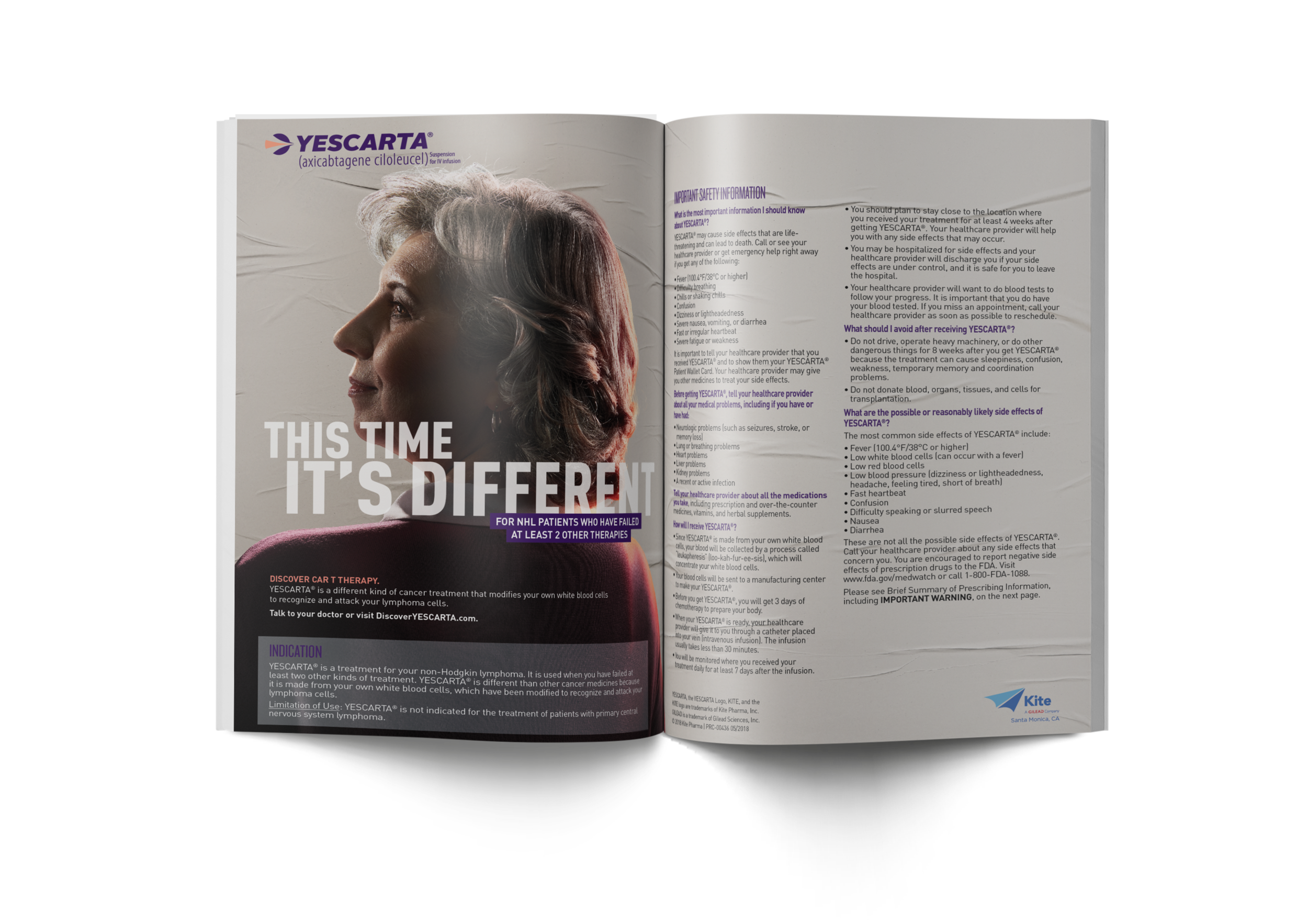
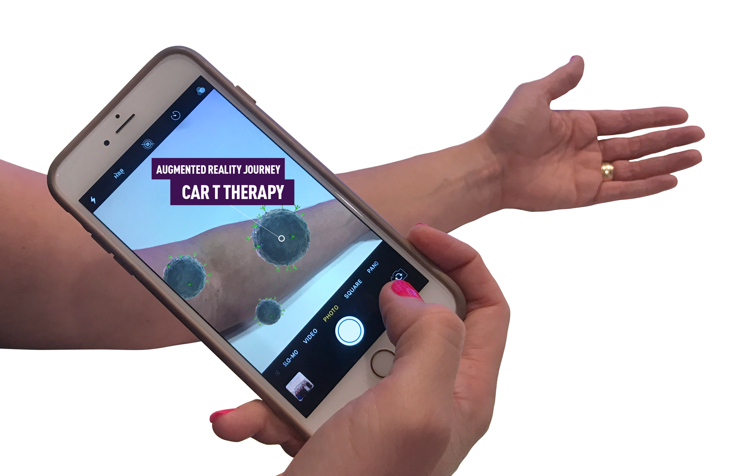
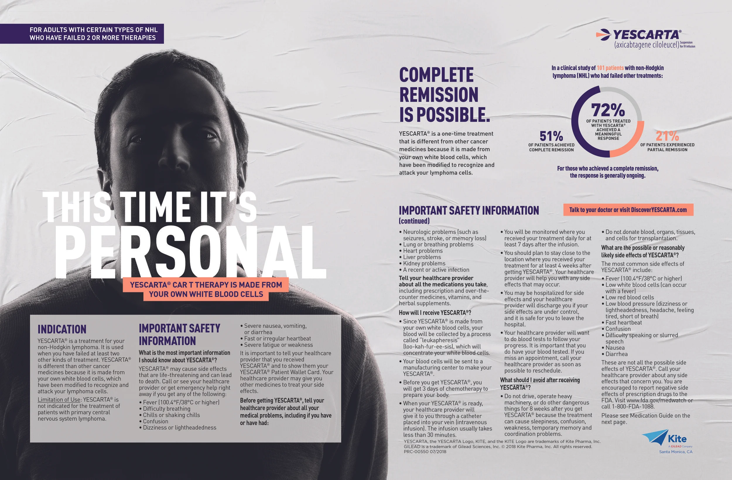
Few innovations in oncology represent a bigger shift in how we approach cancer treatment than YESCARTA—a groundbreaking CAR T-cell therapy that harnesses the power of a patient’s own immune system to fight relapsed or refractory non-Hodgkin lymphoma.
I helped develop the creative strategy and brand experience for YESCARTA, translating complex cell therapy science into a powerful, accessible story of precision medicine, possibility, and patient-driven strength. The work included a hero campaign, comprehensive brand guidelines, and an interactive iDetail tool designed to educate healthcare professionals and elevate understanding of this transformative oncology treatment.
This project reflects my ability to bring breakthrough medical innovations to life, turning highly complex science into compelling brand experiences that inspire confidence and advance meaningful conversations in cancer care.
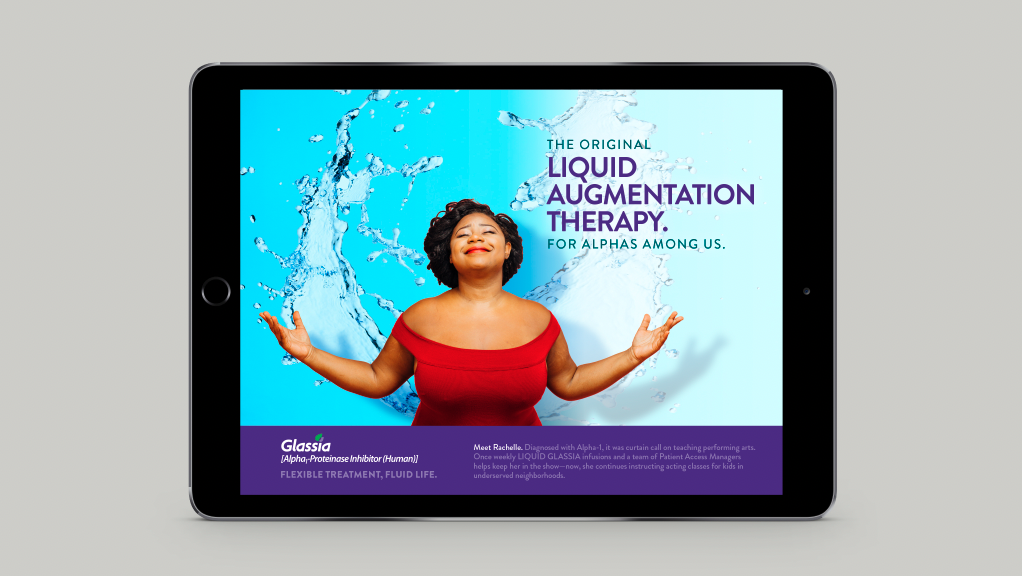
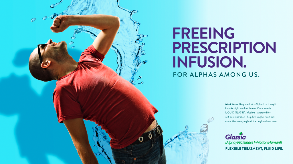
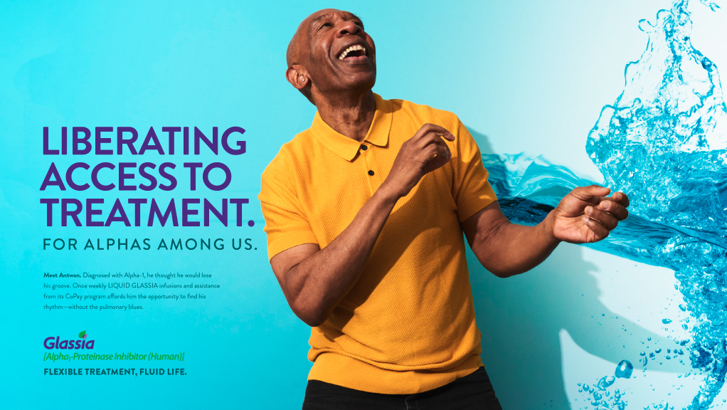
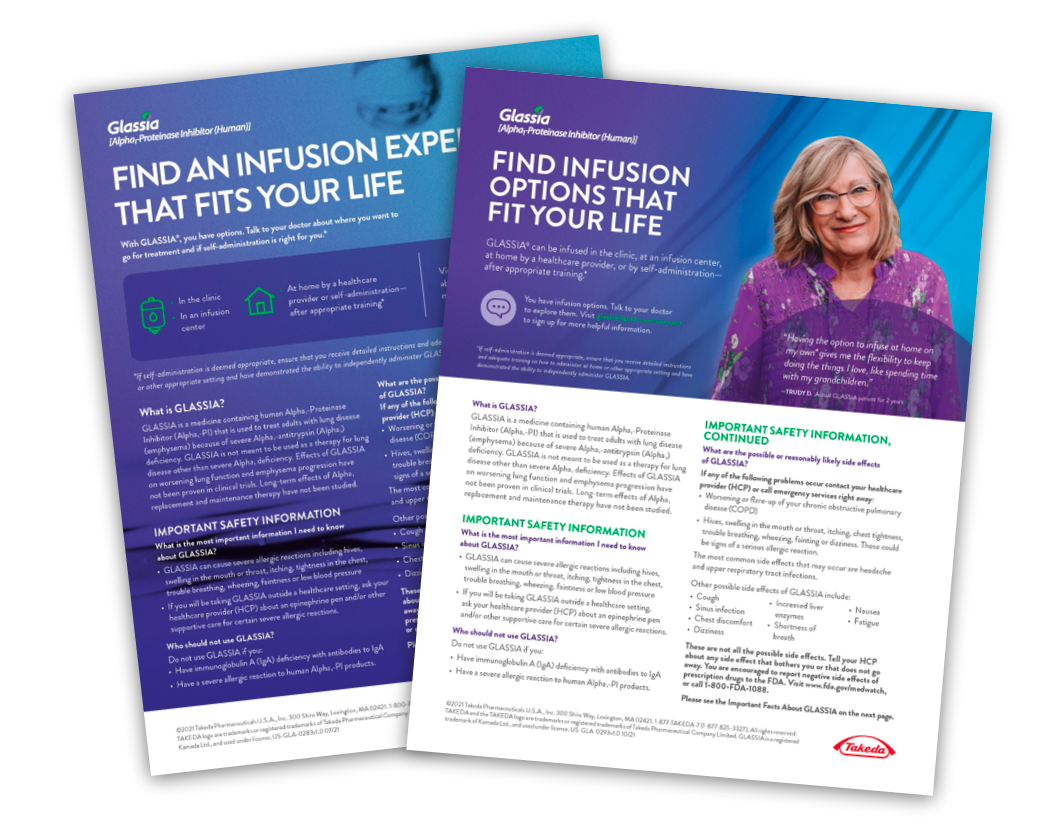
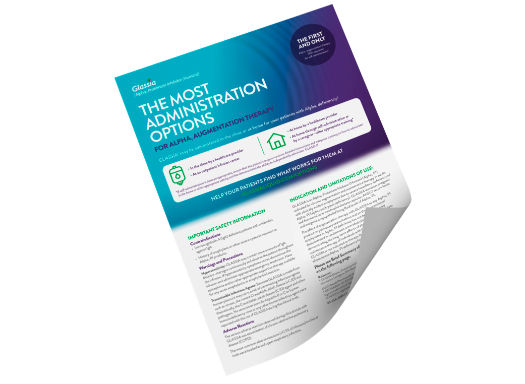
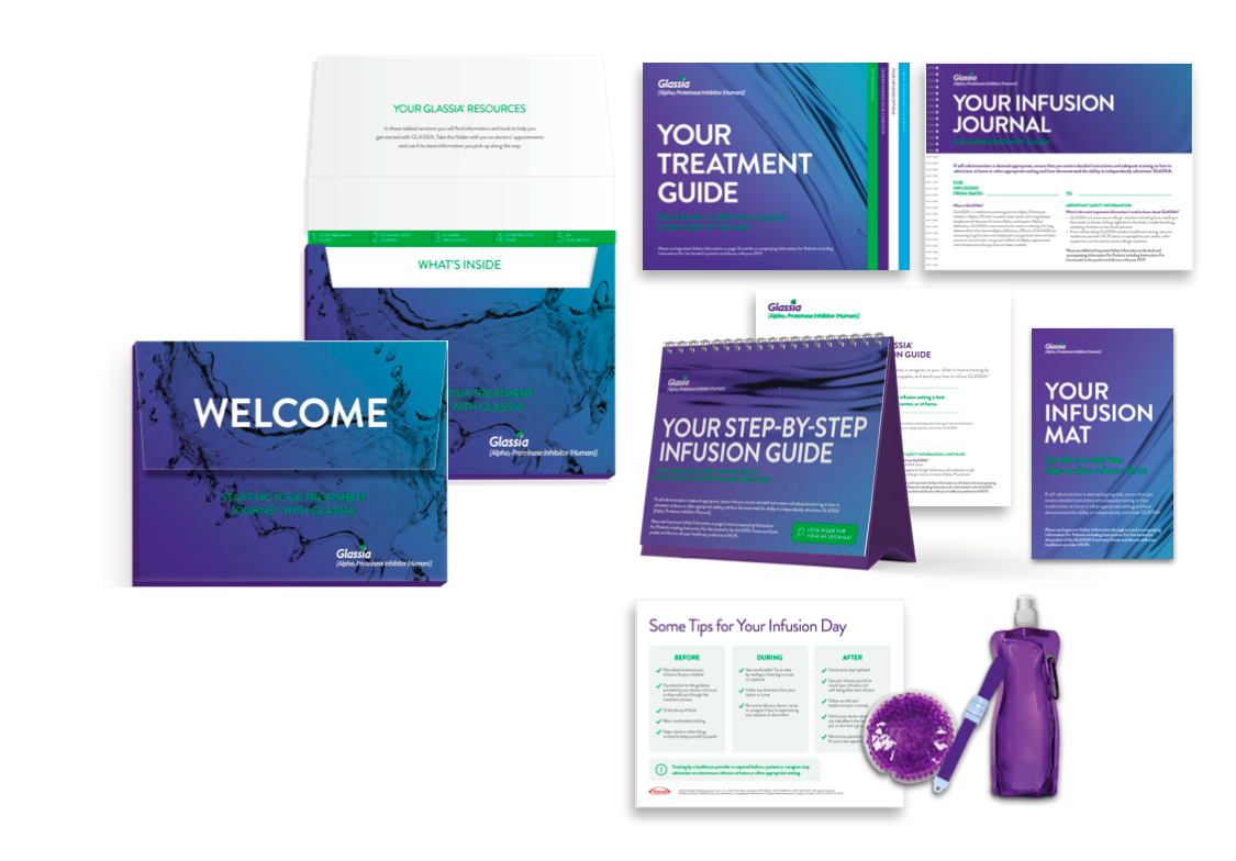
Rare diseases require more than medical solutions—they require stories that bring understanding, hope, and clarity to patients and healthcare providers. I developed the creative strategy and visual direction for GLASSIA, a targeted treatment for adults living with emphysema caused by severe Alpha₁-antitrypsin deficiency, translating a complex disease mechanism into a compelling human-centered narrative.
By focusing on the idea of addressing the condition at its source, the campaign created a clear and approachable framework to communicate GLASSIA’s role in supporting patients with this rare genetic disorder. The work demonstrated my ability to transform complex medical concepts into strategic, visually engaging brand experiences that connect scientific innovation with real patient needs.
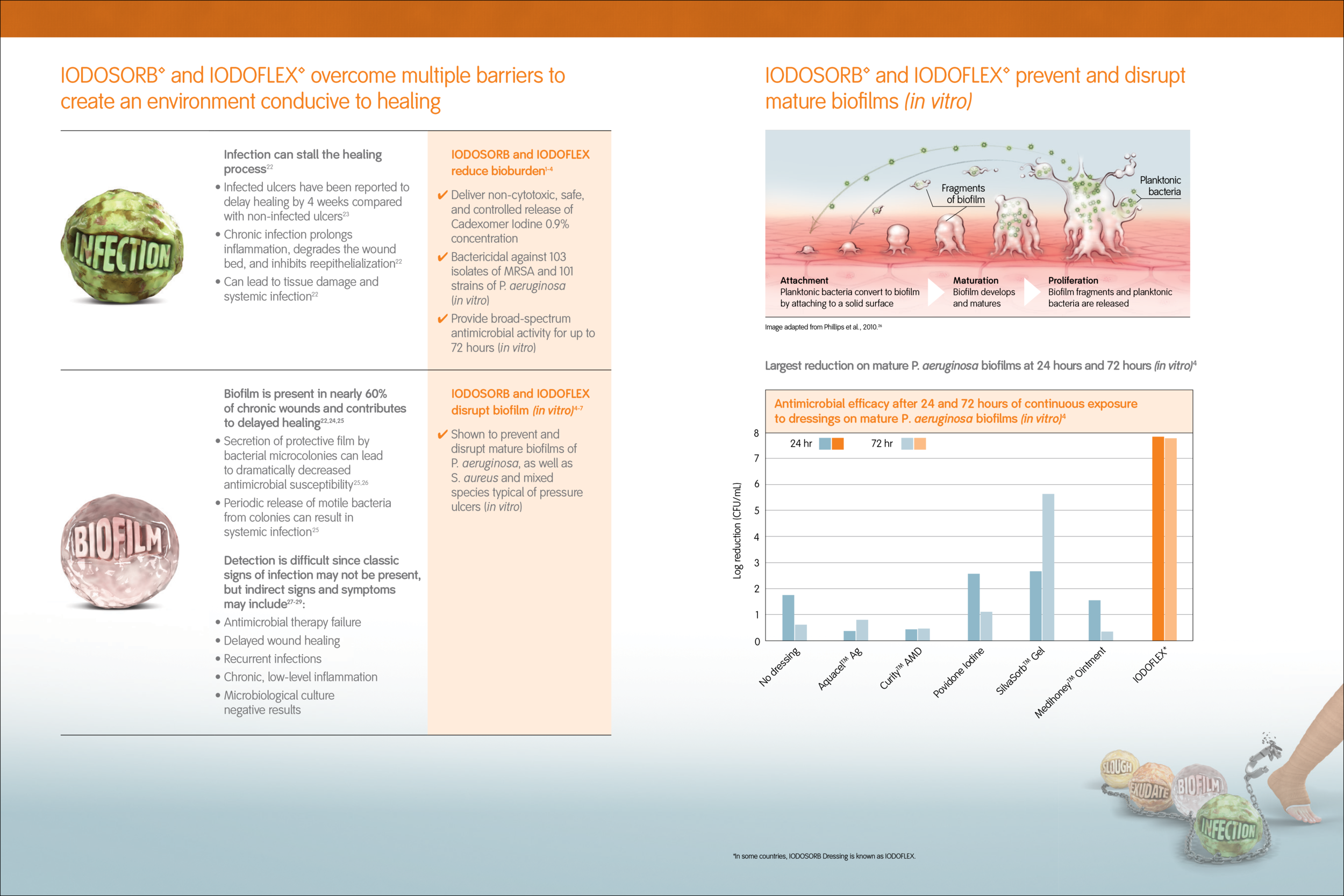
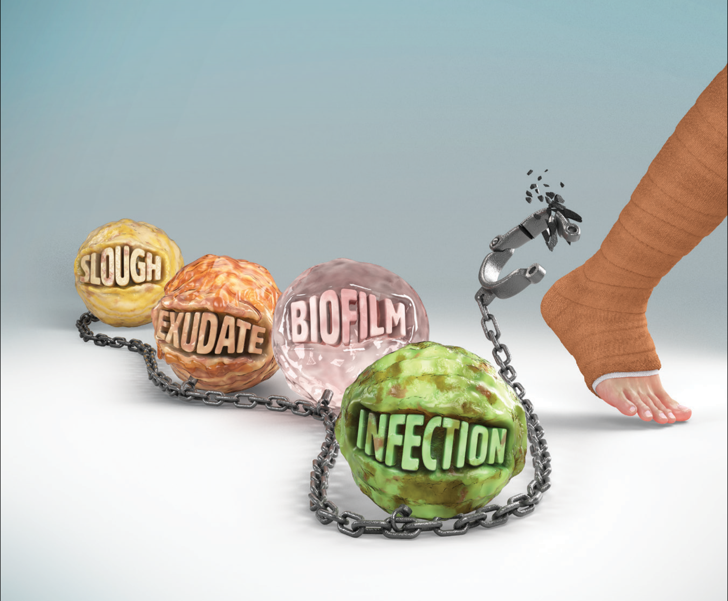
Healing isn’t just about treating a wound—it’s about helping patients break free from what holds them back. I developed the creative concept for IODOSORB and IODOFLEX, translating the science behind cadexomer iodine-based wound care into a powerful and emotionally resonant visual story.
The campaign used the metaphor of a patient breaking free from a symbolic ball and chain to represent the physical and emotional barriers caused by chronic wounds, bringing the product benefit of infection management and improved healing conditions to life in an instantly understandable way.
This work demonstrates my ability to uncover compelling human insights, transform complex clinical benefits into memorable creative ideas, and build healthcare communications that connect with both emotion and purpose.
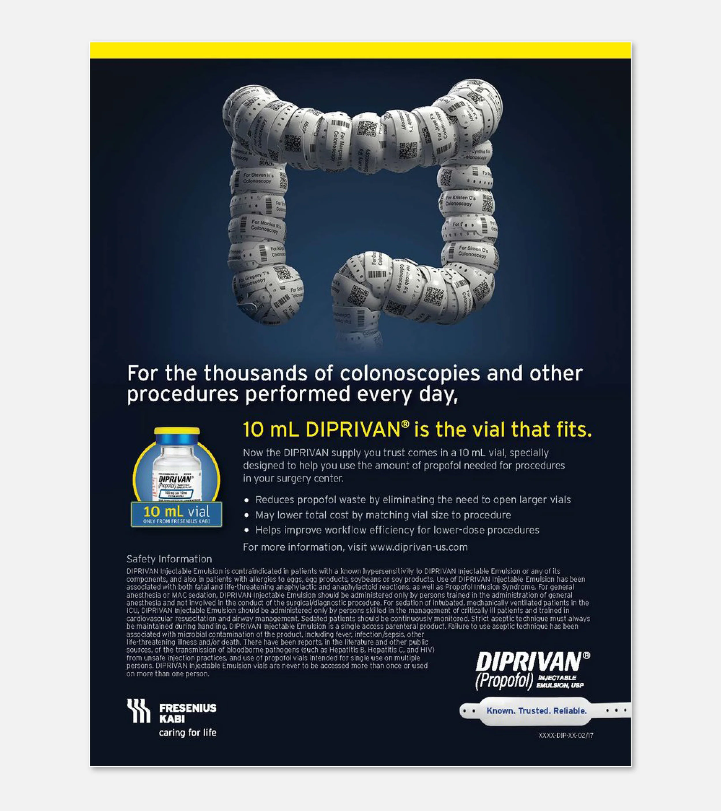
The most impactful healthcare campaigns connect clinical innovation with the human experiences behind every decision. For DIPRIVAN, I helped create a highly targeted visual system for healthcare professionals that transformed complex surgical contexts into a powerful reminder of the patients at the center of care.
Through anatomical artworks of the colon, eye, and heart—each meticulously constructed from hundreds of patient ID bracelets—the campaign created a striking visual metaphor for the connection between medical expertise and human lives. The work reinforced the critical role of informed clinical decisions while bringing empathy and humanity into the conversation around anesthesia and sedation.
This project demonstrates my ability to translate complex healthcare concepts into emotionally resonant brand experiences that educate, engage, and connect with professional audiences.
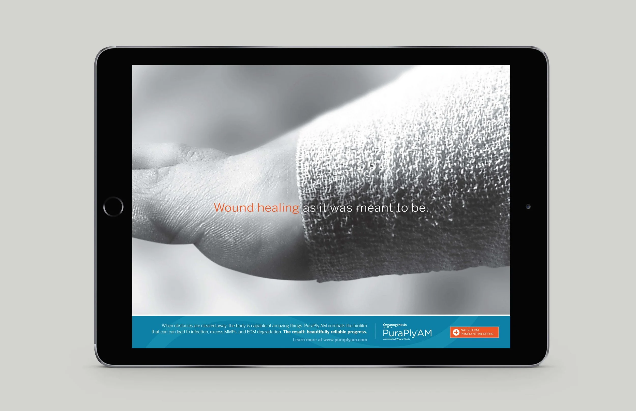
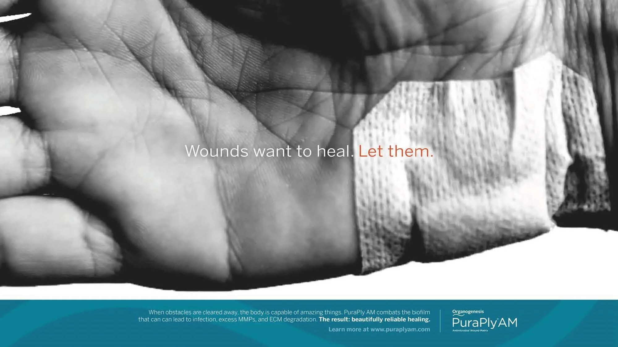
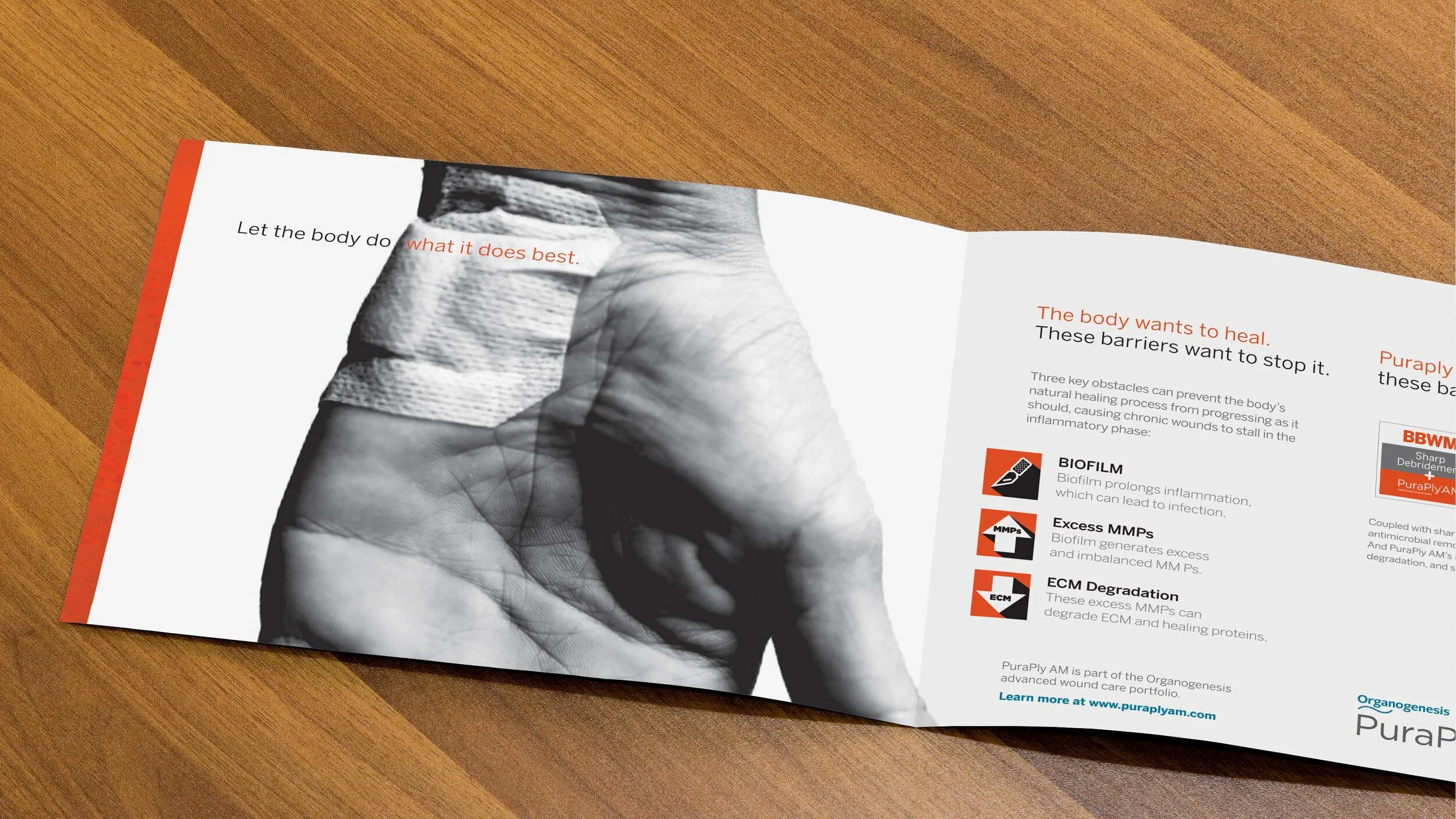
In a category defined by complexity, the strongest brands create clarity and confidence. I developed the creative strategy and visual direction for PuraPly, a versatile wound matrix designed to support the management of acute and chronic wounds, including diabetic, venous, pressure, vascular, trauma-related, and burn injuries.
The campaign transformed a broad clinical story into a unified brand platform, highlighting PuraPly’s ability to support diverse healing needs through a clear, cohesive visual and messaging system.
This work showcases my ability to simplify complex healthcare solutions, uncover a compelling brand narrative, and create strategic communications that build understanding among healthcare professionals while reinforcing clinical value.
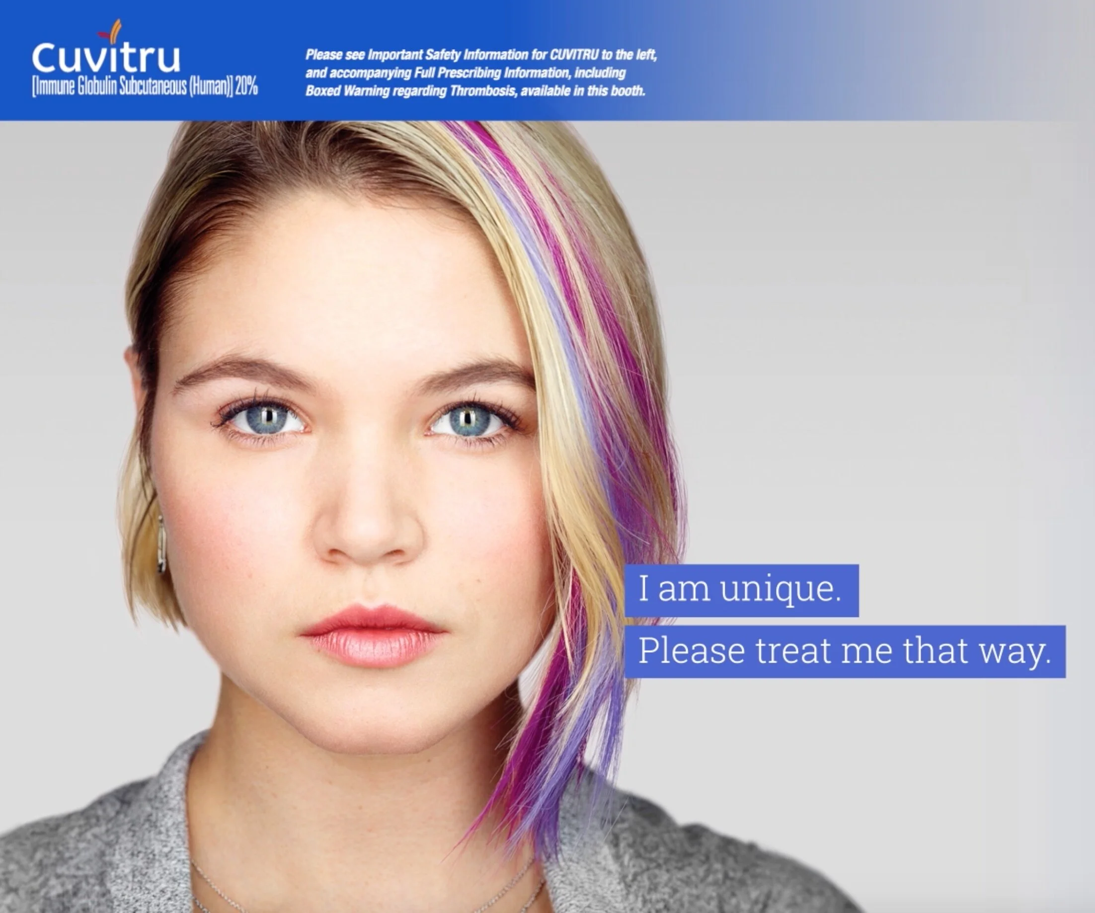
The most impactful healthcare storytelling creates an emotional connection while empowering patients with confidence and clarity.
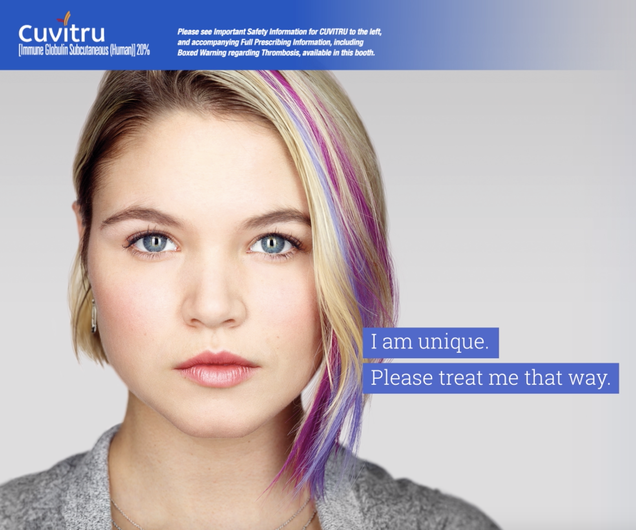
For CUVITRU, a customizable subcutaneous immunoglobulin therapy for people living with primary immunodeficiency (PI), I helped create a patient convention video designed to engage and inspire the community. By blending authentic storytelling with approachable, patient-focused creative, the video reinforced the brand's commitment to helping people manage their condition with greater flexibility and independence.
This project reflects my ability to develop meaningful healthcare experiences that connect with audiences on a human level while strengthening brand affinity in a highly regulated space.
Helping bring a breakthrough oncology therapy to life through digital storytelling was an opportunity to combine purposeful design with meaningful healthcare innovation.
Brukinsa is a leading targeted treatment for multiple adult blood cancers, and I partnered on the creative development of its virtual booth experience to translate complex clinical science into an engaging, premium brand experience for healthcare professionals.
This project highlights my ability to craft visually compelling, medically accurate work that elevates innovative healthcare brands while creating experiences that inform, engage, and inspire confidence.
Great campaigns start with ideas that are strategically grounded, creatively differentiated, and built to resonate with the audience. I developed a range of branded campaign concepts designed to solve key business challenges and create meaningful connections with healthcare professionals.
The first five concepts were selected and validated as the strongest strategic and creative directions through testing, demonstrating their ability to stand out, communicate effectively, and drive engagement. These HCP-focused concepts represented the work that rose to the top, advanced through client review, and moved forward as leading candidates for formal campaign development.